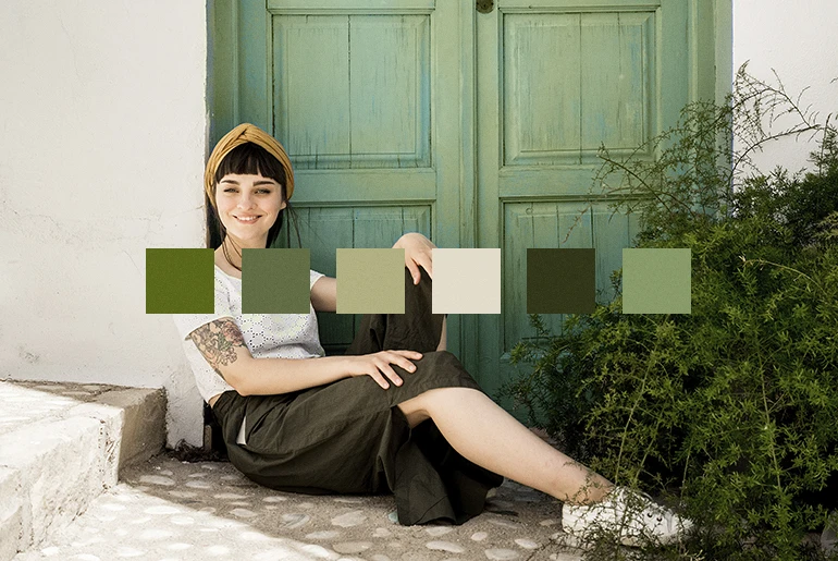
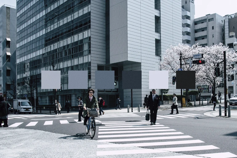
We often take colors for granted but they’re such an integral part of our life and environment. From the calm greenish-blue color scheme of a forest to the slate gray color palette of a busy city, colors convey emotions and tell stories. This is why designers and photo editors always pay close attention to the color schemes when designing.
You don’t have to stick with primary colors when designing. When chosen thoughtfully, the right color scheme can include any type of color combinations. The secret to picking a thoughtful color scheme lies in understanding the basics of color theory. In this article, we’ll cover everything you need to know about color schemes, including good color combinations, color palette ideas, trending design inspiration, and how to create a color palette from an image.
What Is a Color Scheme?
First things first, a color scheme or color palette is a combination of colors intentionally used together in design or photo editing. You don’t have to be a professional designer to create a palette of colors that go together.
Before we dive into the process of making a color palette, we need to first understand the basics of color theory and the color wheel. The color wheel is a visual organization of colors based on their relationship to one another. Primary colors are the basis of the color wheel, which then evolve into secondary colors, tertiary colors, and so on. You could say that color theory rotates around the color wheel.
In the world of art, graphic design, interior design, and web design, color theory dictates how to combine colors together for the right aesthetic. But there isn’t a single method when it comes to picking color combinations, as different color schemes can be used to tell a variety of stories. For example, fall color palettes, which tend to be full of mauve, terracotta, orange, and green colors, speak to the richness of the changing season and invoke memories tied to sound, smell, and sight.
What Are the Types of Color Schemes?
While there are almost endless color combinations that you can explore, lets first take a look at six of the most common color schemes.
Monochromatic Color Scheme
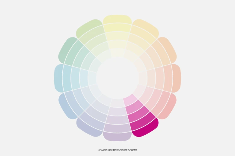
Monochromatic color schemes are one of the easiest color schemes to create, making them a perfect starting point for beginners. A monochromatic color palette consists of a single base hue and its different shades, tones, and tints. Generally speaking, the limited nature of this color pairing makes it a color scheme that is easy to design.
Keep in mind is that if used incorrectly, monochromatic color palettes can look a little plain and uninspired. In order to avoid this, try using contrasting neutral colors to help guide the viewer’s eyes or textures to add richness and dimension.
Analogous Color Scheme
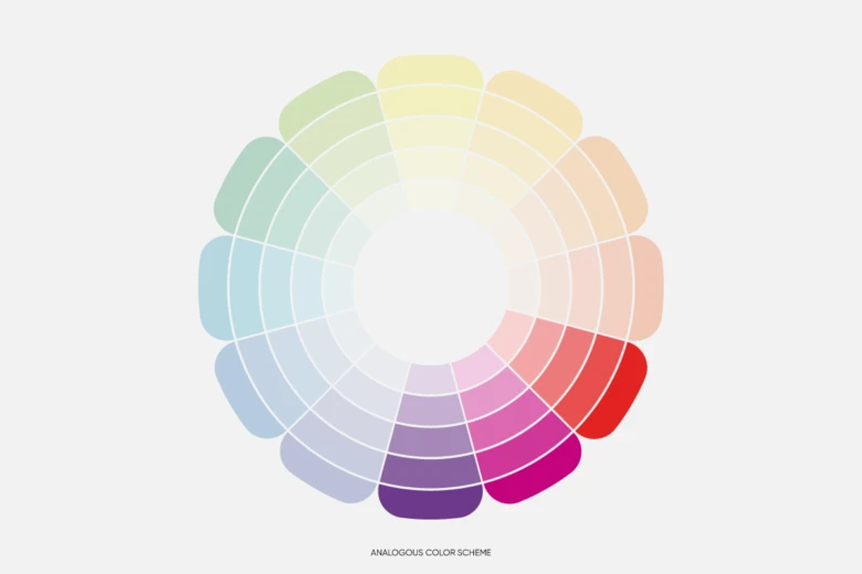
Analogous colors refer to groups of three colors that are located next to one another on the color wheel. You can create analogous color pairings either in the cool or the warm sector of the color wheel. In order to do this, simply divide the color wheel in half where yellow and green meet, and you’ll have the warm colors on one side and the cool colors on the other.
Pro tip: you don’t have to limit yourself to only three colors in an analogous color scheme. Using different tones, shades, and tints can make for more interesting color palette ideas.
Complementary Color Scheme
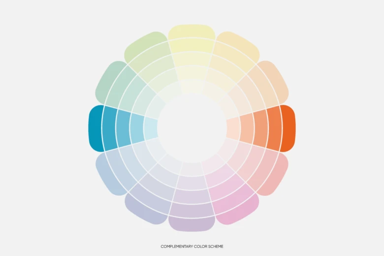
For a simple complementary color palette, you’ll need to combine two colors from the opposite sides of the color wheel. For example, red and green are located directly opposite one another on the wheel, so they’re complementary colors.
More often than not, you need more than two colors for a color palette, so play around with different tones, tints, and shades of the two colors you’ve picked. You often see complementary colors used in color palettes for holidays, brands, sports teams, and even in living room decor. Consider how well the following colors go together: red and green, shades of blue and orange, and magenta and yellow.
Split Complementary Color Scheme
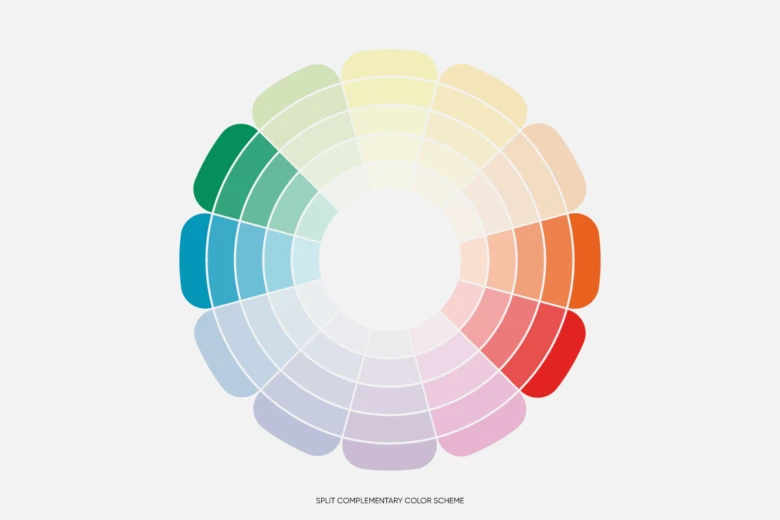
Now that we’ve walked through some of the more approachable color schemes, it’s time to take things up a notch and dive into a few more technical ones. For a split complementary color scheme, you’ll need a single base color and two secondary colors. These are colors that are symmetrical in their placement on the wheel in relation to your base color. Keep in mind that the base color should to be the main color in your image while the secondary colors should be leveraged mainly for accents and highlights.
Triadic Complementary Color Scheme
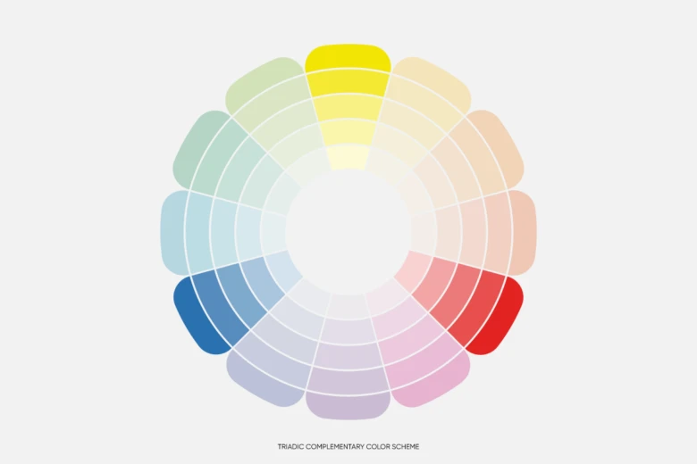
If you’re still looking for the perfect color pairing, consider a triadic complementary color scheme. This consists of three colors that are evenly spaced out around the color wheel. A triadic color scheme often adds depth and visual interest to almost any type of design. Try it out by pairing any of these combinations: purple, green, and orange; dark blue, yellow, and red; or pink, sky blue, and orange.
Tetradic Complementary Color Scheme
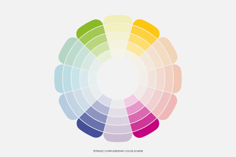
The tetradic complementary color scheme follows the same logic as a triadic color scheme, only this time you’ll need to find four different colors that are evenly spaced out on the color wheel. Examples of color palettes for this pairing style include: green, orange, light blue, and light pink; and purple, yellow, red-orange, and blue-green.
How Many Colors Should Go Into a Color Scheme?
Great news – there isn’t a fixed number of colors needed to create a color palette. It’s entirely up to you and the mood that you’re trying to evoke. The most basic color palettes usually include two to three colors, but can go up to 20 colors or more. Ask yourself, what am I trying to achieve, and what will make my fans most excited?
If you’re just starting out with color theory, then your color palette should consist of somewhere between three to six colors. This is more than enough to create intricate designs. Start with smaller and easy color palettes and slowly move up to more complicated ones.

How Do You Choose a Color Scheme?
Choosing the right color scheme depends on the type of message you want to convey with your design. For example, if you’re trying to create a calm feeling for a spa promotional poster, a neutral monochrome color palette might be best whereas a complementary color scheme might be too strong given its use of directly opposing colors.
Ask yourself what message, tone, and feelings you want your design to convey. If you’re trying establish a color palette for a brand, consider the color palettes of brands you admire and your competitors. But don’t copy their palette! Just look for color inspiration and create a color scheme that is unique to your brand aesthetic.
What Are Some Color Scheme Ideas?
Speaking of color palette ideas and inspiration, it’s time to get creative! We’ve broken down a starter set of diverse color palette ideas that you can use for any type of design. Whether you’re a beginner or an experienced designer, these color palette ideas will definitely come in handy!
Urban
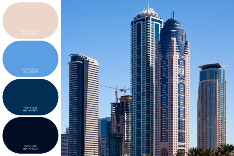
If you’re looking for something more sophisticated and reminiscent of bustling city-life, then you consider a monochromatic color scheme with blue or grey tones. This color scheme is perfect for portraying the busy nature of big cities and concrete jungles.
Vibrant and Clean
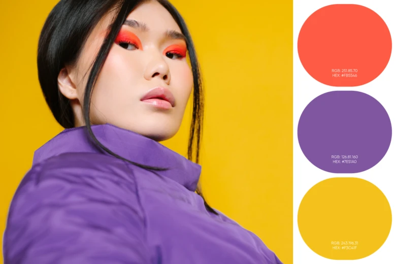
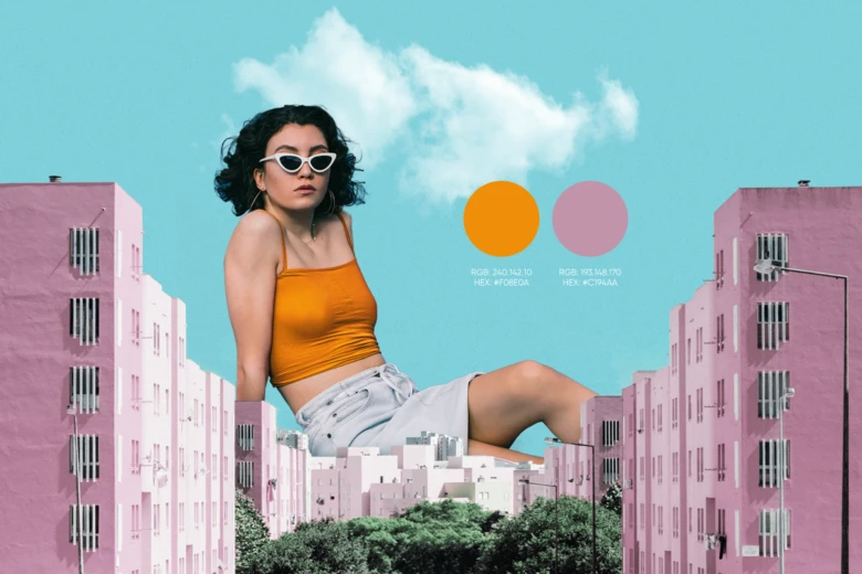
With the use of vibrant complementary colors, you can achieve a crisp look for your designs. Use contrasting warm and cool colors, but don’t forget to use some lighter tones as accent colors to make the design colors easy on the eyes.
Colorful Pastel
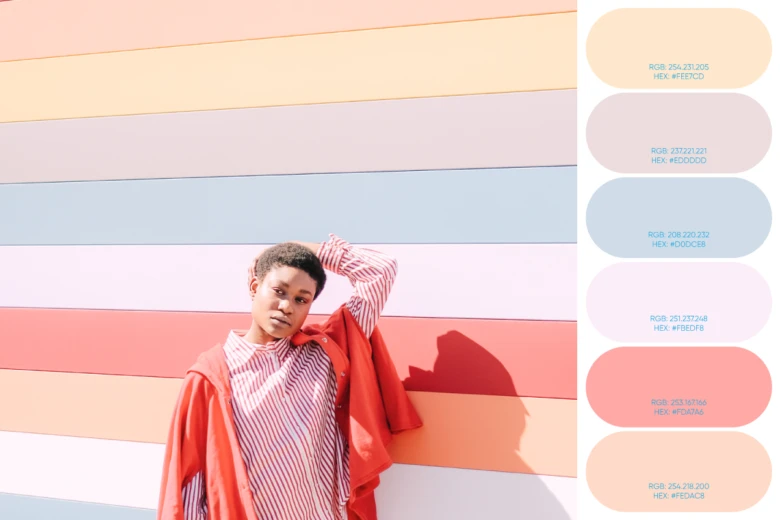
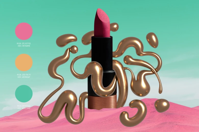
Pastel colors can create a fun 80s inspired environment or convey a soft touch, both of which are very trendy at the moment. This color scheme combines both warm and cool colors, but all of them are pastel tones.
How Do You Create a Color Scheme From an Image?
There’s nothing more sophisticated than a consistent palette in design work. Whether you’re designing a logo, editing photos, or building an entire website color scheme, keeping a consistent theme with a fixed color palette is key.
We recommend building a color palette off of a specific hero image. That way it’s easy to apply your color scheme to future creative. Here’s how create a color scheme from an image:
If editing on web:
1) In the Picsart web editor, click on New Project to start a new design.

2) Click Upload in the left Editor toolbar and upload an image you’d like to create a color scheme from. If you don’t have a specific one, click on Photos and search from our stock photography library.

3) From the left toolbar click on Elements then select the shape you’d like to display your color scheme in. Resize and place the shape where you’d like to put your color scheme on your photo.
Pro tip: The most commonly used color palette shapes are the square and circle, but feel free to play around with a variety of shapes depending on your brand.
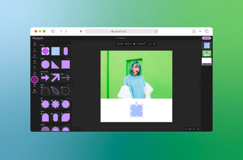
4) Click on the color wheel from the top toolbar. Now, hover your mouse on your image to select the exact color from the image that will make your color scheme. If you have a specific hex code in mind, you can also type it in here.
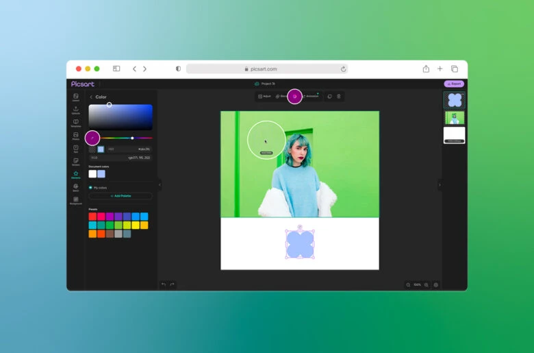
Repeat steps 2-4 as many times as needed to build out your full color palette.
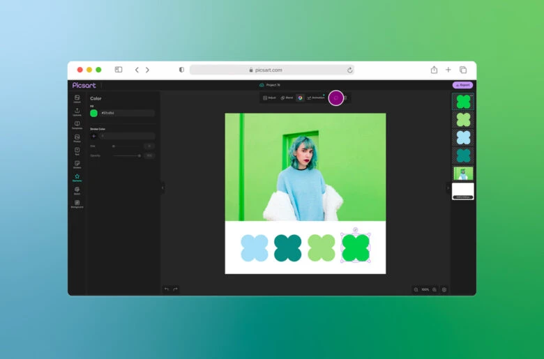
5) Click Export to download your custom color scheme to your computer.
Pro tip: If you only want to display your color scheme (and not the image that inspired it), then delete the layer containing the original image using the layers on the right toolbar.
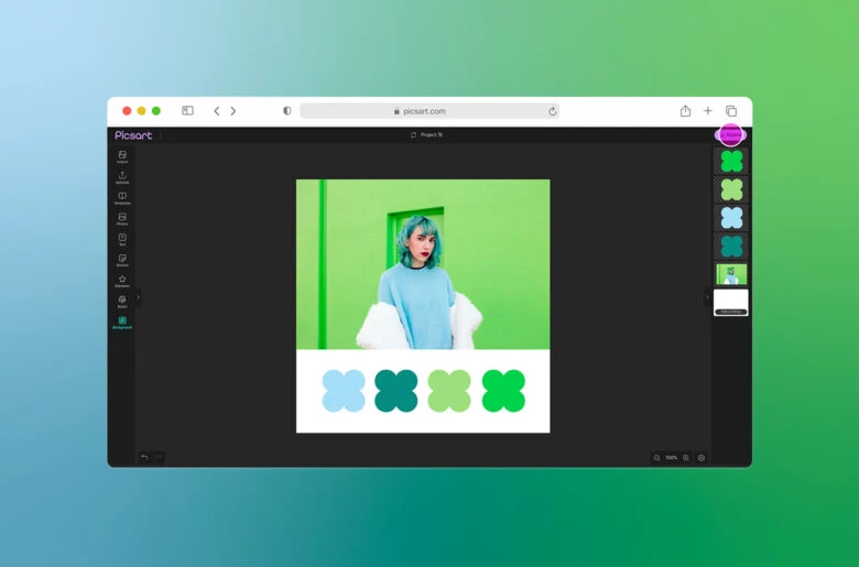
If editing on mobile:
1) Open the Picsart app and tap the purple “+” button to start a new project. Under Photos, select the image you’d like to create a color scheme from.
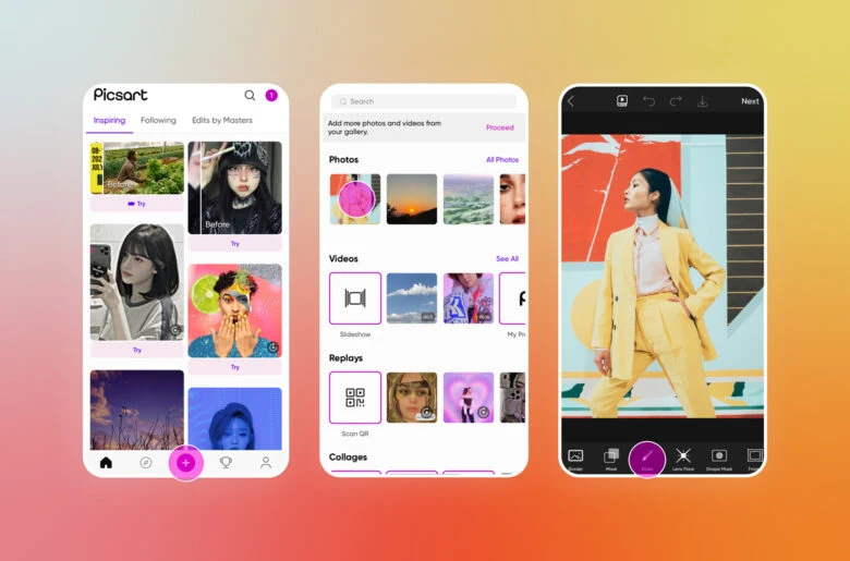
2) Scroll across the Editor toolbar and select the Draw tool. Tap the overlapping square and circle icon in the bottom left to open the Shape tool.
3) Select the shape you’d like to display your color scheme in, make sure Fill is selected below it, and tap the checkmark at the top. Then tap and drag across your screen to apply the shape and resize or move it around.
4) Tap the color picker in the bottom-left corner. Use the eyedropper tool to select the color from your image that will make your color scheme.
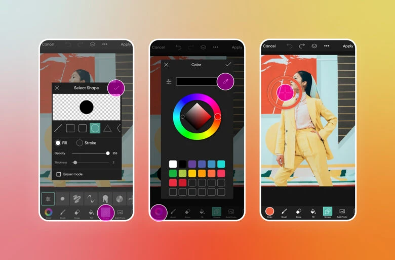
5) Repeat steps 2-4 as many times as needed to build out your full color palette. Tap Apply and then Next in the top-right corner to complete your project.
Pro tip: If you only want to display your color scheme, tap the layers button in the bottom-right corner and hide the layer containing the original image.
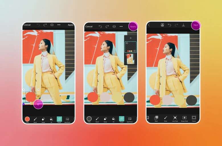
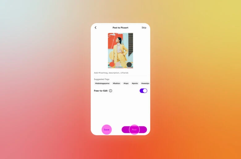
6) Now, select Save to download your final color palette to your device or Post to share your work with the Picsart community.
Create at the Speed of Culture
Picsart is a full ecosystem of free-to-use content, powerful tools, and creator inspiration. With a billion downloads and more than 150 million monthly active creators, Picsart is the world’s largest creative platform. Picsart has collaborated with major artists and brands like BLACKPINK, Taylor Swift, the Jonas Brothers, Lizzo, Ariana Grande, Jennifer Lopez, One Direction, Sanrio: Hello Kitty, Warner Bros. Entertainment, iHeartMedia, Condé Nast, and more. Download the app or start editing on web today to enhance your photos and videos with thousands of quick and easy editing tools, trendy filters, fun stickers, and brilliant backgrounds. Unleash your creativity and upgrade to Gold for premium perks!

