When infographics first came on the scene, they were a unique way to set your website and content marketing apart. But with the help of easy to use photo editing tools, now anyone can create effective infographics. So if you want to stand out, you’ll need to use marketing and graphic design principles to take your image to the next level. We’ve compiled a list of the best infographic tips below to get you started.
What is an Infographic?
At their core, infographics combine images and words to share information in a visual way. They can come in many forms: graphs, step-by-step guides, chronological timelines, and more. Savvy marketers use infographics to draw attention to a specific message that may get lost or skimmed over if it were simply typed out. However, the best infographics are more than just a tool for data visualization – they tell a story.
A great infographic can go a long way in helping you reach new potential customers and achieve your content marketing goals. When done right, infographics are snappy visuals that can be shared across social media platforms, included in emails, and used to spice up your blog posts.
So what makes a good infographic? A combination of market research and smart design choices. Read on for 12 infographic tips to consider before you get started on your next design.
Planning Tips for Effective Infographics
Infographics are a powerful tool for telling multi-layered stories. They help people visualize complex information, making it easier to understand and more fun to read. Effective infographics are also very appealing to visual learners and serve as a great way to break up a page full of words.
To start planning your infographic design, you’ll first need to figure out what you want to say and (more importantly) why you want to say it. Why is it important for a potential customer to see this message? Will it help increase brand awareness, show how your brand is different from your competitors, or drive a purchase decision? Asking yourself why will help you figure out what kind of information to include in your design.
Once you know why you’re making your infographic, the next step is to outline the information and then start creating. Effective infographics should be two things — easy to understand and fun to read. An infographic should do all the heavy lifting for the reader, breaking down complex information into small, easy-to-digest, visually compelling parts.
12 Pro Tips to Create Beautiful Infographics
Whether you’re just starting out or you already have dozens of infographics under your belt, consider using these 12 tips on how to create an effective infographic:
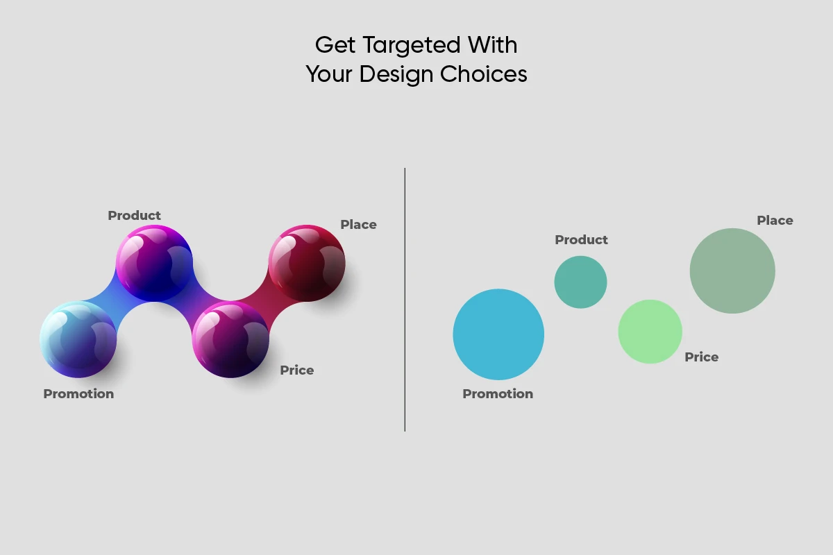
1) Get Targeted With Your Design Choices.
This is the first of our infographic tips because it’s the most important. Before you start designing an infographic, you should do a little research on which colors and design choices resonate with the people you’re trying to reach. Which types of images do they interact with the most? For example, do they like cartoons and bright colors or minimalist sketching and monochrome?
A good place to start your research is to look through relevant keywords on social media sites and see which graphic design trends seem to be the most popular among your target audience.
2) Put Some Thought Behind Your Color Scheme.
When used thoughtfully, colors can be used to evoke specific emotions in design. For example, earth tones are popular with wellness brands because they evoke a feeling of calm among viewers. Finance companies tend to use a lot of green to symbolize wealth.
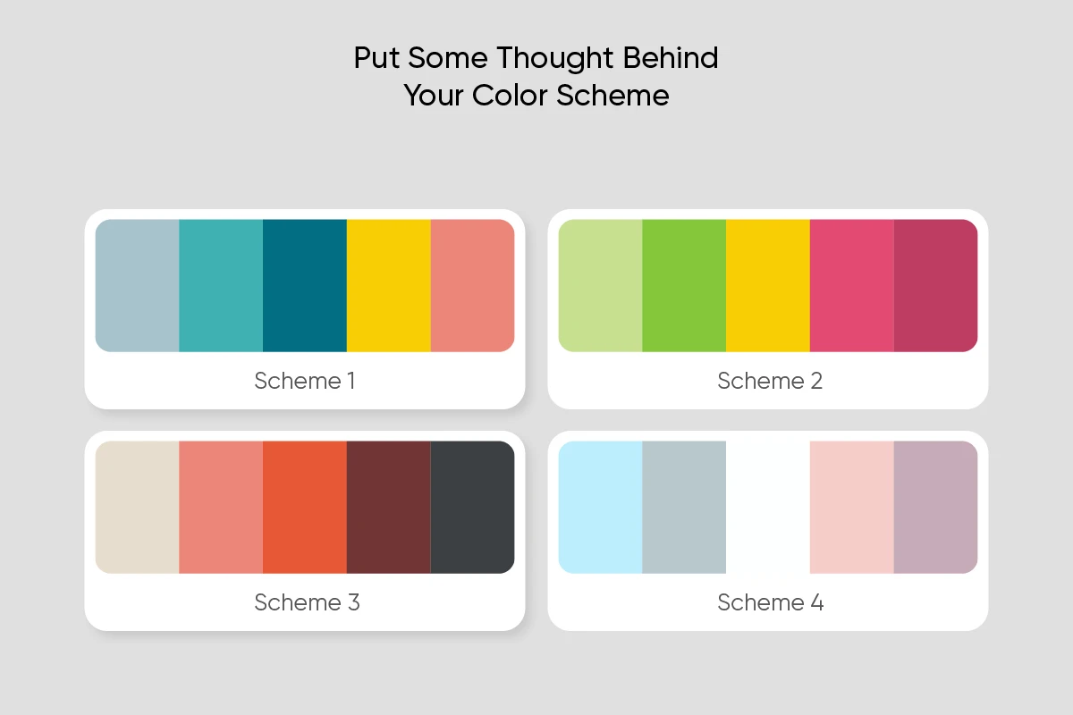
Pro infographic tip: create your color palette early on. You should decide ahead of time if you want to use a bright, varied color scheme or a muted color palette with strategic pops of color to emphasize certain parts of your image.
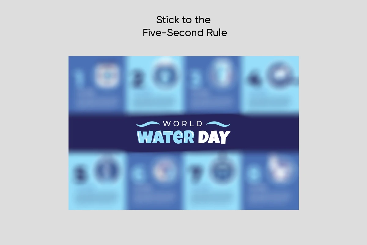
3) Stick to the Five-Second Rule.
No, we’re not talking about eating food off the ground (thankfully). This five-second rule refers to how long it should take for someone to read and understand your infographic. The whole point of infographic design is to present information in a way that’s easy to understand and fun to look at. If your infographic takes more than a few seconds to get its message across, there’s a good chance that people will scroll right past it.
Clarity is a big part of what makes a good infographic. Try to include only the information vital to getting your point across. It’s better to split your message into two or more infographics than to create a crowded design that’s hard for people to read.
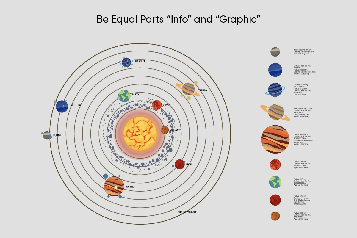
4) Be Equal Parts “Info” and “Graphic.”
A good infographic is so much more than just some words on a colored background. It should tell a story that brings in the reader and elevates the information you’re trying to convey. Search for fun cartoons, icons, or stickers that can reinforce the message of your infographic. You can also include pie charts, bar graphs, and line graphs to help your audience visualize your data points.
Infographic design tip: If you can’t find the sticker you’re looking for, it’s easy to create your own.
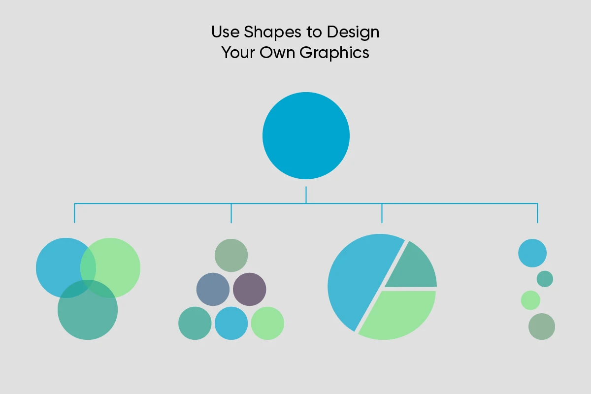
5) Use Shapes to Design Your Own Graphics.
Make your infographics look more professional by designing custom shapes to help display your information. If you can’t find the perfect template, it may be time to take things into your own hands. You don’t have to be a graphic designer to use shapes to create custom images that accent and complement the information in your infographic.
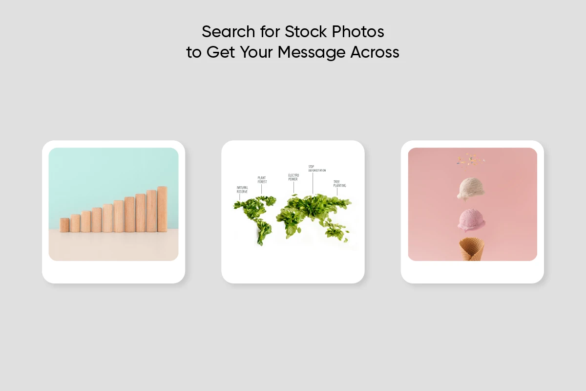
6) Search for Stock Photos to Get Your Message Across.
Stock photos can add a human touch to your infographic design. Once you find a relevant image, you’ll need to make the background of the photo transparent to add just the subject to your infographic. If you’re going to put text over your photo, make sure that they’re the right color, size, and opacity to be easily read.
Pro tip: Check out this handy guide to stock photography if you’re just getting started with it.
7) Space Your Design Elements to Achieve Visual Balance.
Composition refers to how your design is laid out and how the different visual elements relate to each other. Basically, your text, images, and negative space should balance each other out to make a visually appealing infographic.
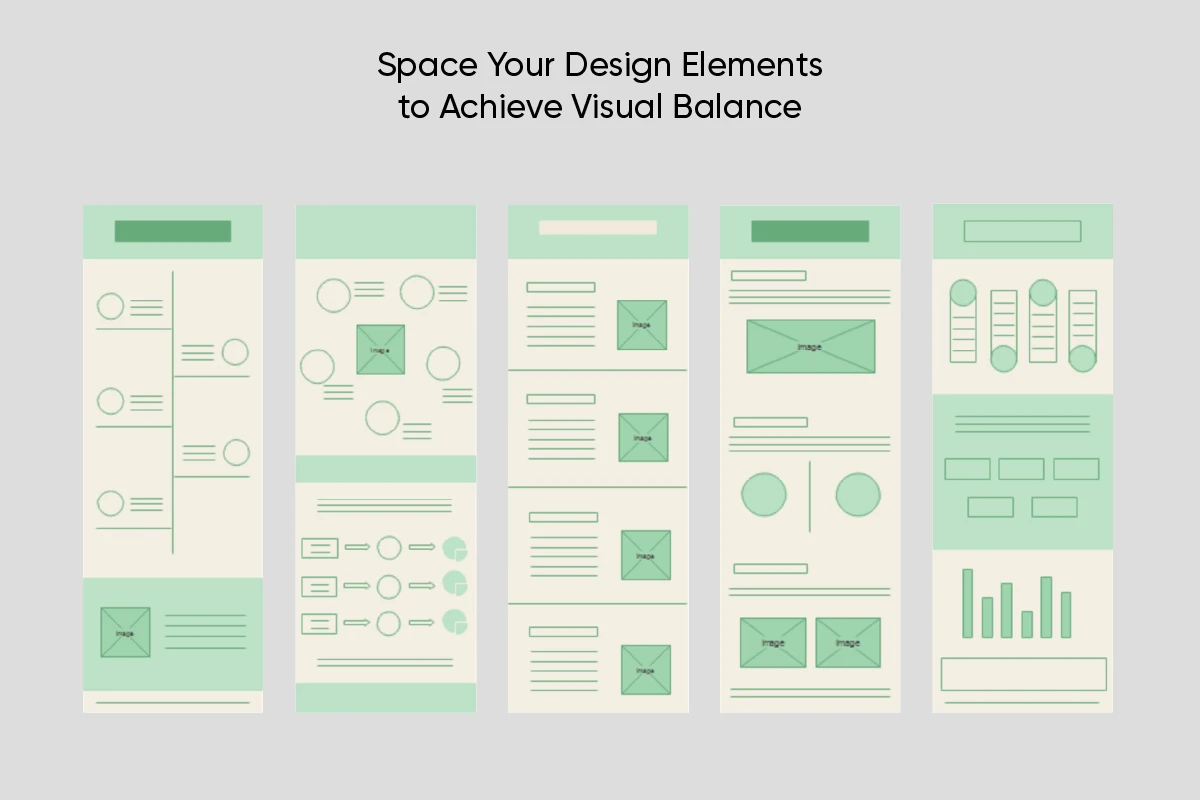
Infographic tip: place a grid over your image while you’re designing to help you plan your composition.
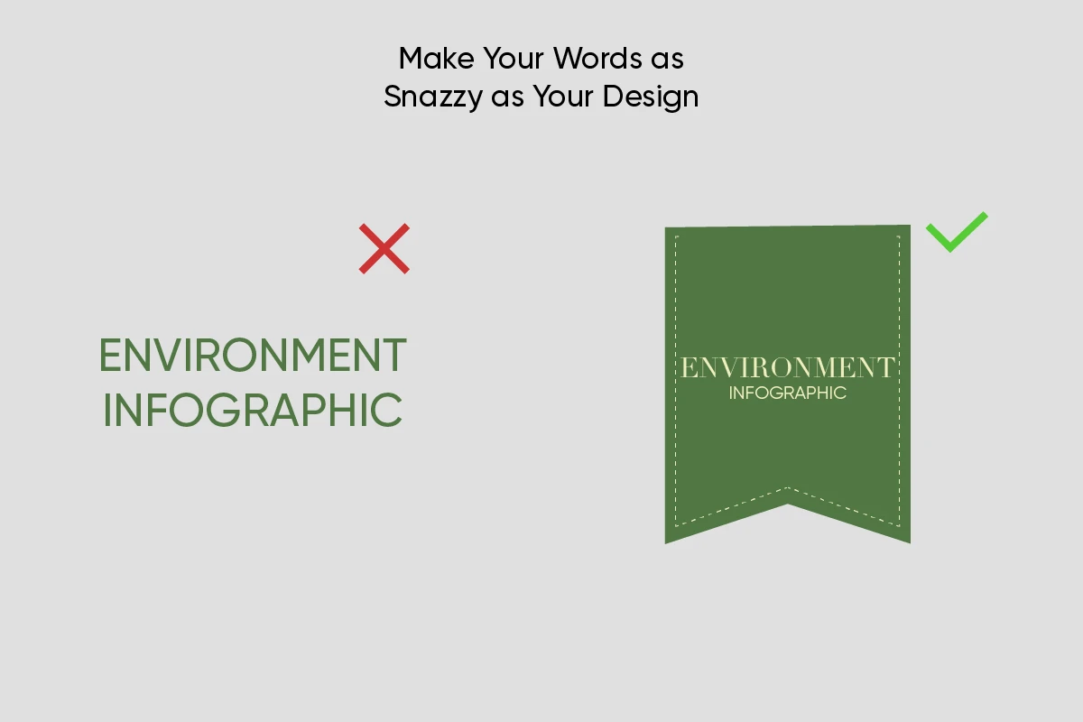
8) Make Your Words as Snazzy as Your Design.
Your design will be the first thing that catches a viewer’s eye. But your text will be what makes them stay – and ultimately take action. If you’re wondering how to make a good infographic, remember to include snappy headlines and descriptions. A good rule of thumb: the less words you use to get your point across, the better. This is one of the easiest infographic tips to enact. Shorter sentences and headlines are more likely to get read than longer ones.
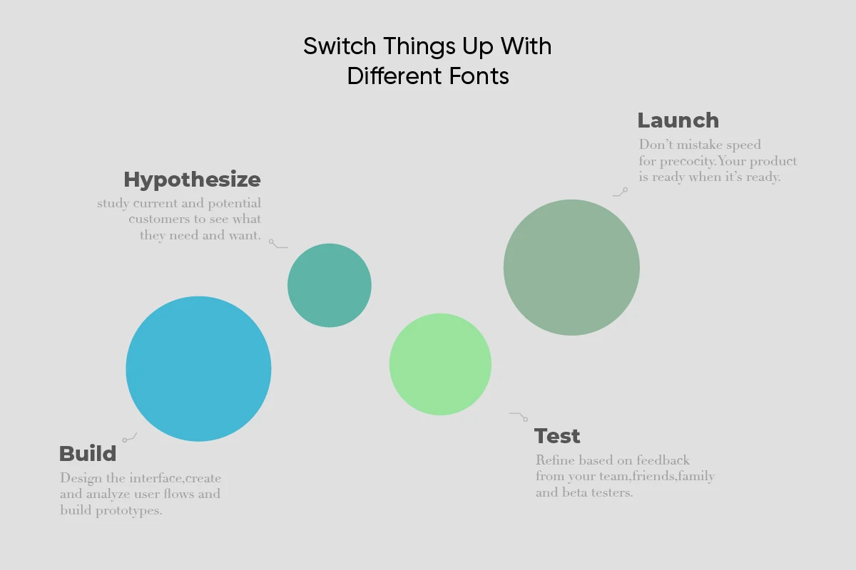
9) Switch Things Up With Different Fonts.
Using different fonts for your headers and body text is one of our favorite infographic tips because it can help add organization and a visual flow to your design. However, not all fonts go together. Effective infographics leverage font pairing techniques to make them both beautiful and easy to read.
10) Use Lines and Arrows to Create a Visual Flow.
Sometimes you have a lot of information you need to include, as you would in a step-by-step guide or a chronological timeline. In this case, our best infographic tips are to use lines and arrows. Sometimes you need to point the reader in the right direction.
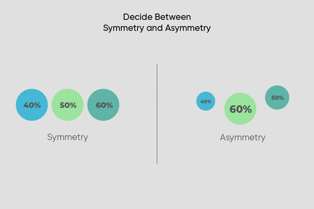
Whether it’s found in nature or in graphic design, symmetry is incredibly pleasing to the human eye. Using symmetry is an essential part of what makes a good infographic. It adds structure, balance, and organization, making your image easier to understand at a glance.
However, asymmetrical images can be beautiful and effective too, adding a sense of movement to your design. When deciding which of these styles is right for you, consider why you’re making the infographic and what type of message you need to get across.
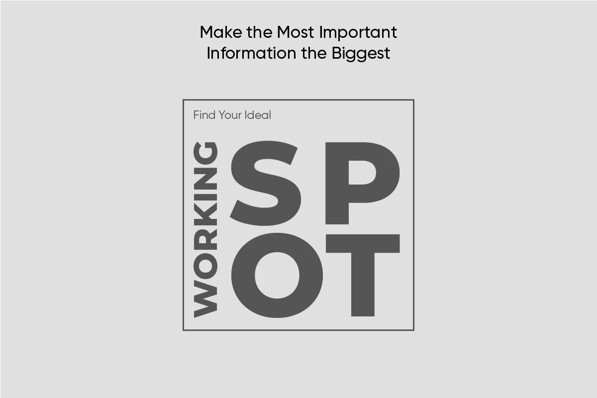
12) Make the Most Important Information the Biggest.
While lines and arrows will help guide the viewer through your design, their eye will usually be drawn to the biggest item in the infographic first. This is called visual hierarchy. Typically, the biggest font should be reserved for your title or headline. As you’re creating the other elements, think about how important they are to your message. Then, make sure that their size reflects that.
How to Create an Infographic Using Picsart
Now that you’re armed with our best infographic tips, it’s time to start creating. Let’s take a look at how to make a good infographic from scratch using Picsart.
If you’re working on desktop, follow these steps:
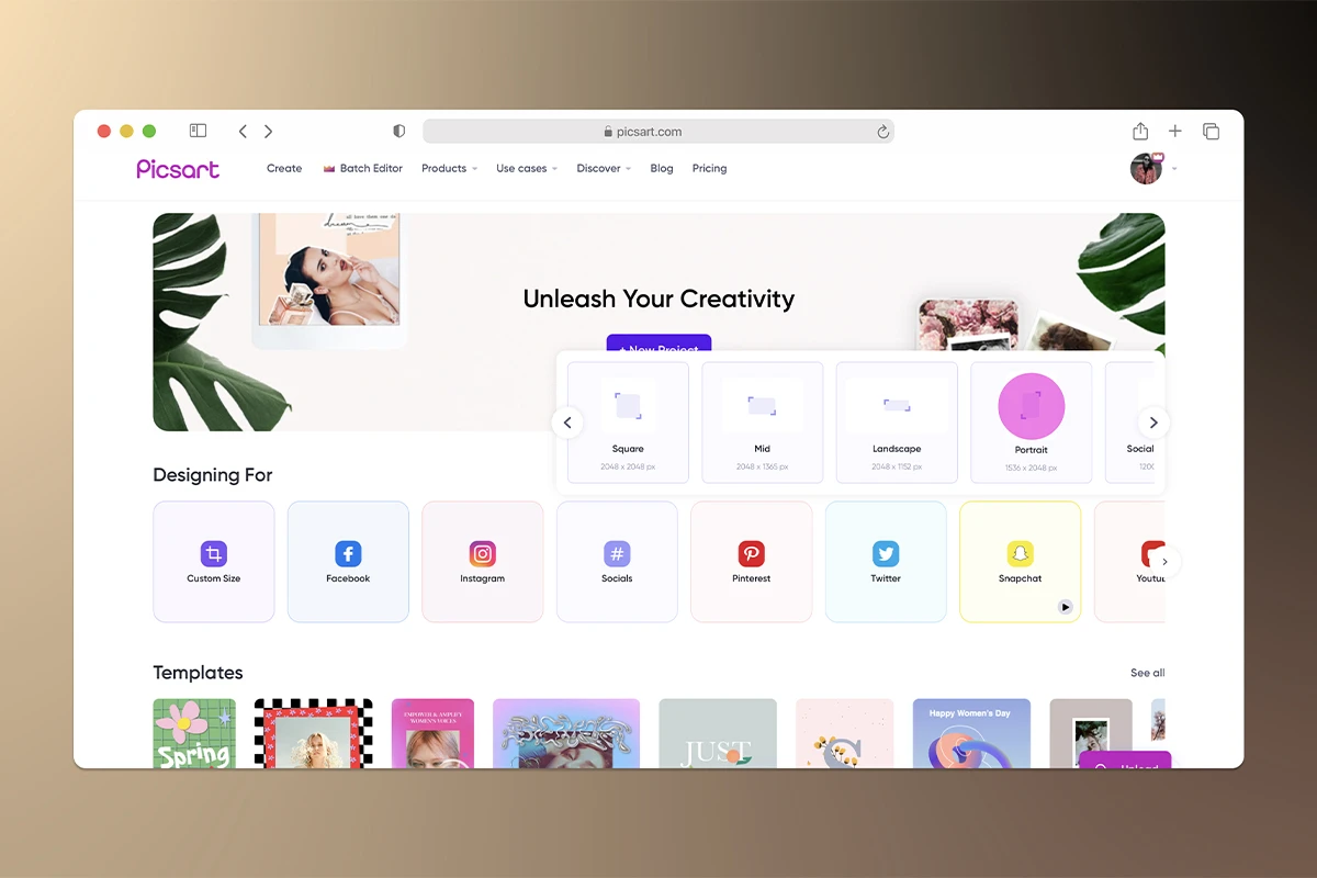
1) Open the Picsart website and select a canvas size. You can always change this later as your design evolves.
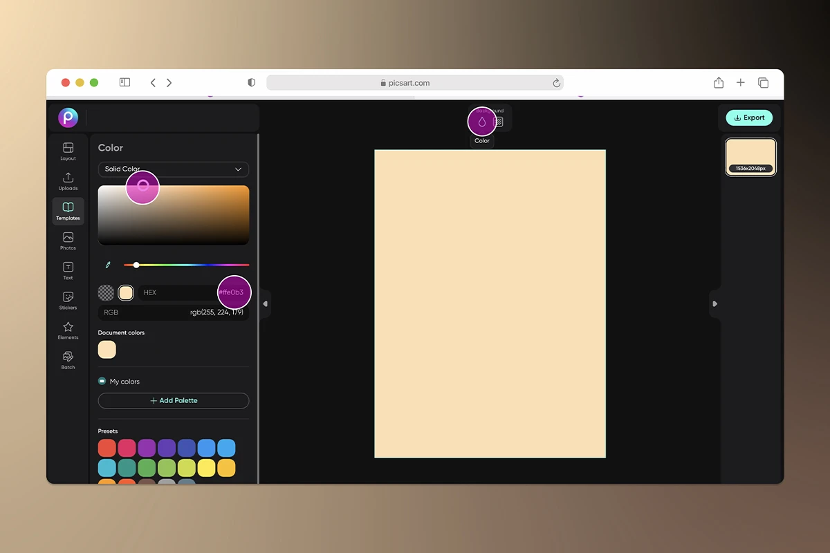
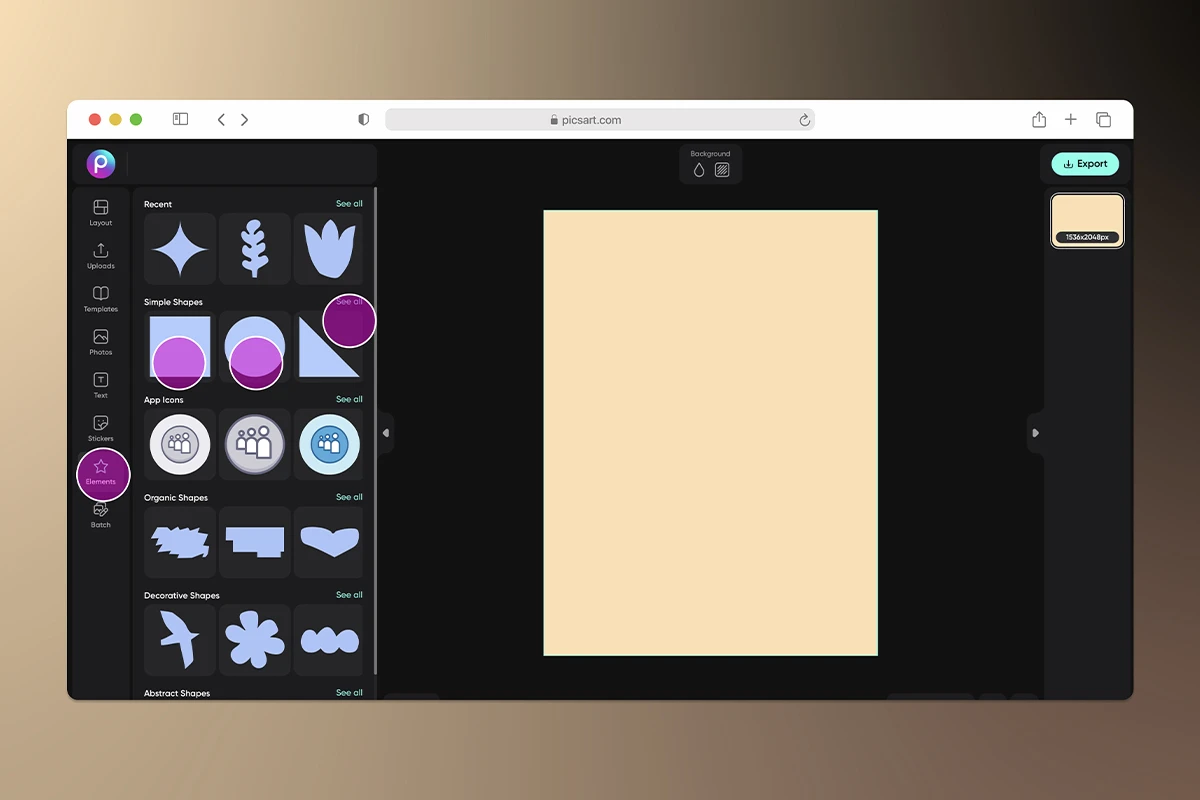
Once you add a shape to your design, you can use the toolbar above the shape to adjust its color and opacity.
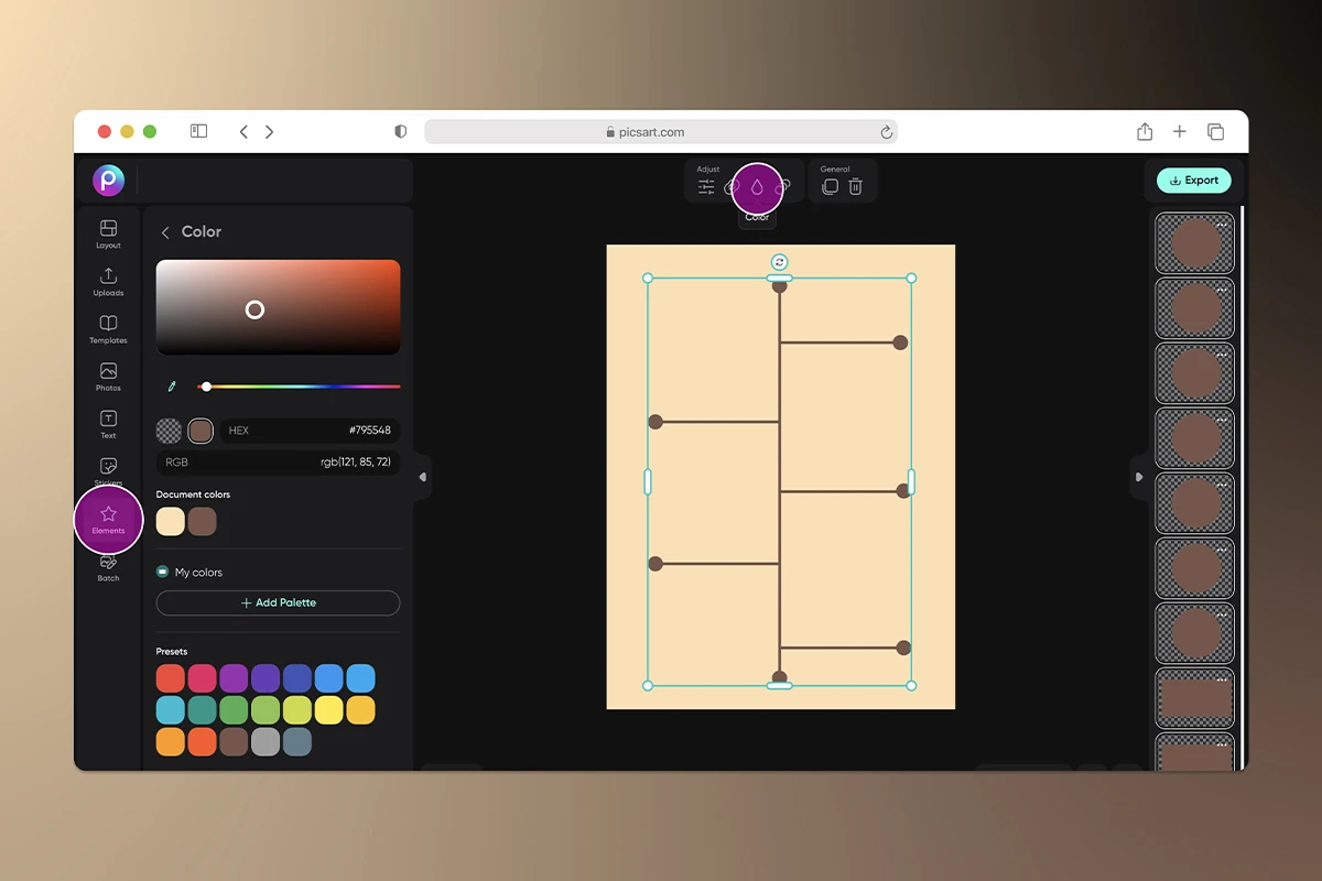
4) Click on Text to add copy to your infographic. Don’t forget that the best infographics use separate text boxes for each piece of information. And as a designer, using separate text boxes will give you the most control to manipulate your text.
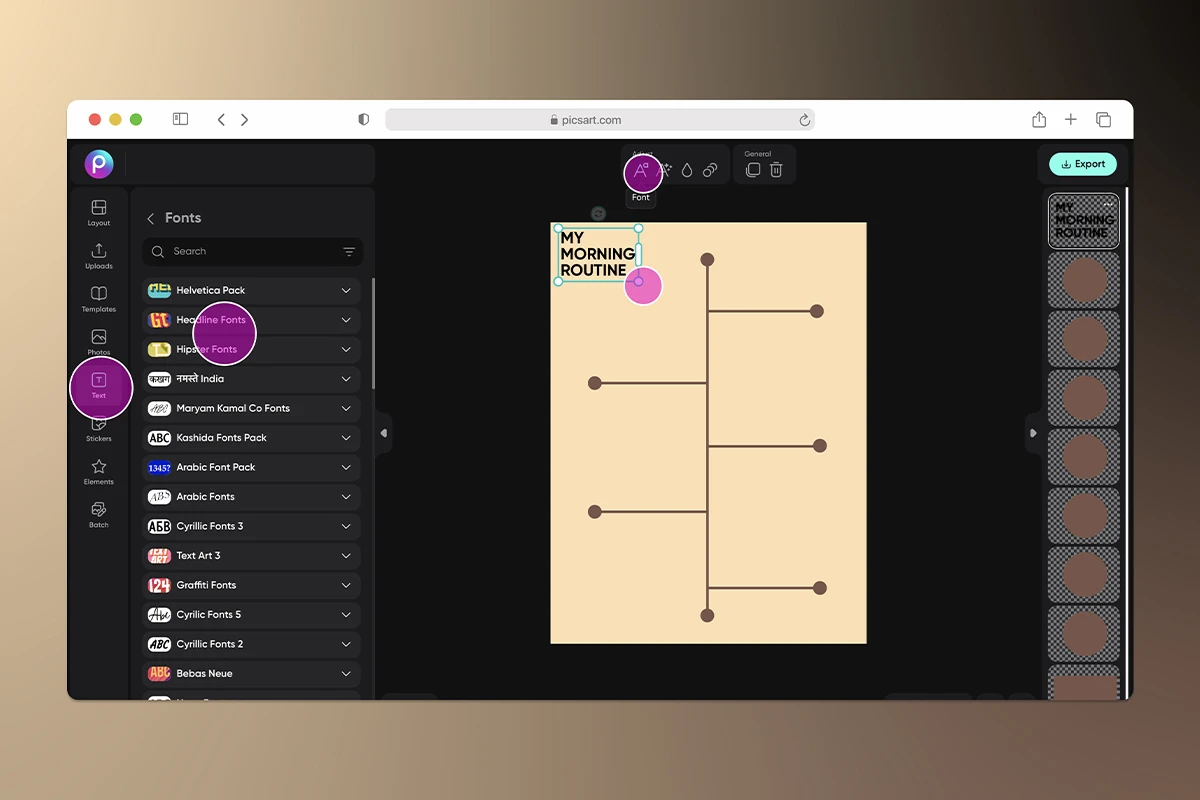
Don’t forget to use the toolbar that pops up over your text box to change the color, font, and style of your text.
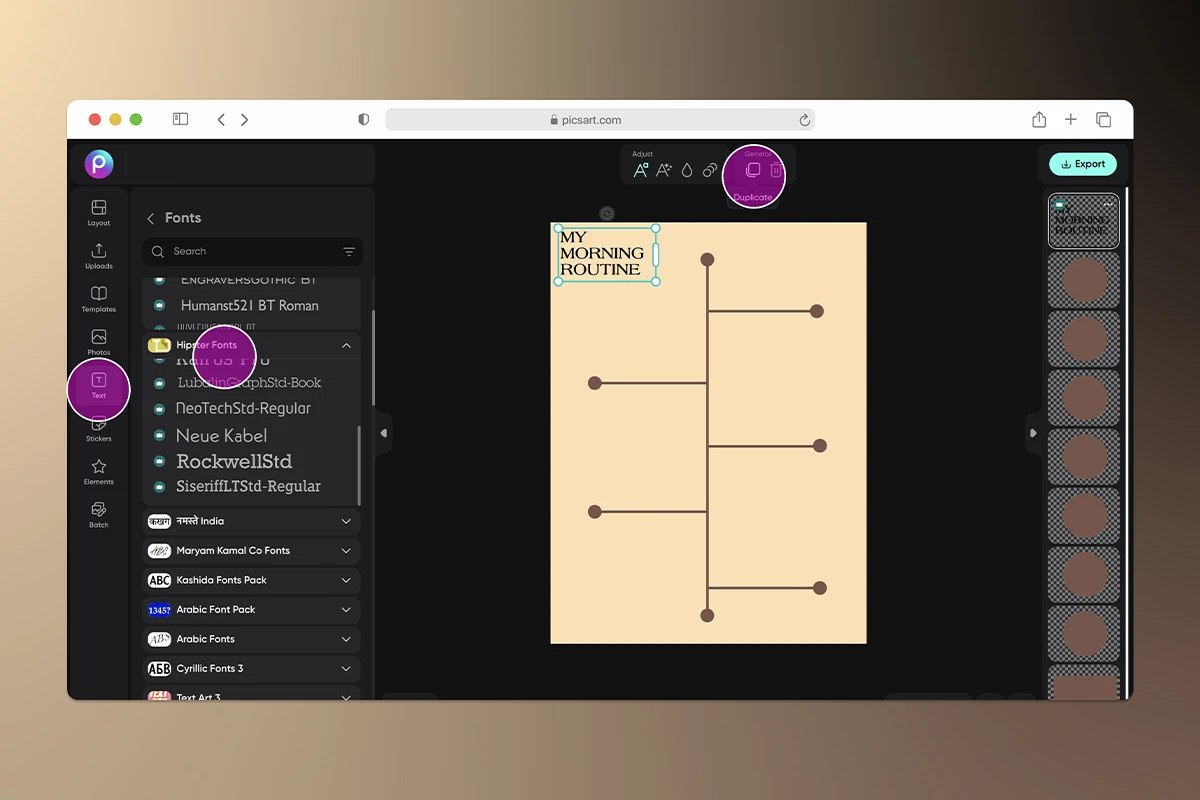
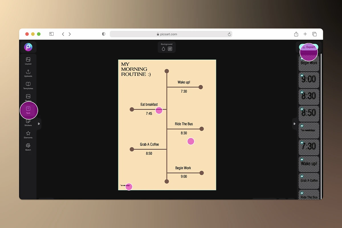
If you’d like to add more visuals, select Stickers or Photos from the toolbar to search for images to add to your infographic. Not seeing what you’re looking for? Try your hand at creating your own stickers.
5) Then, click Export in the top right on the top right of your screen to save your infographic so you can share it to your blog, website, and social media channels.

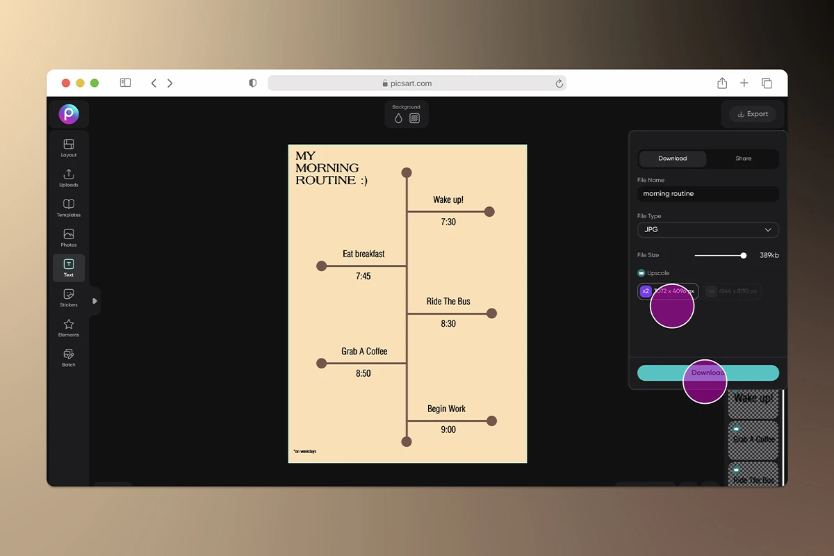
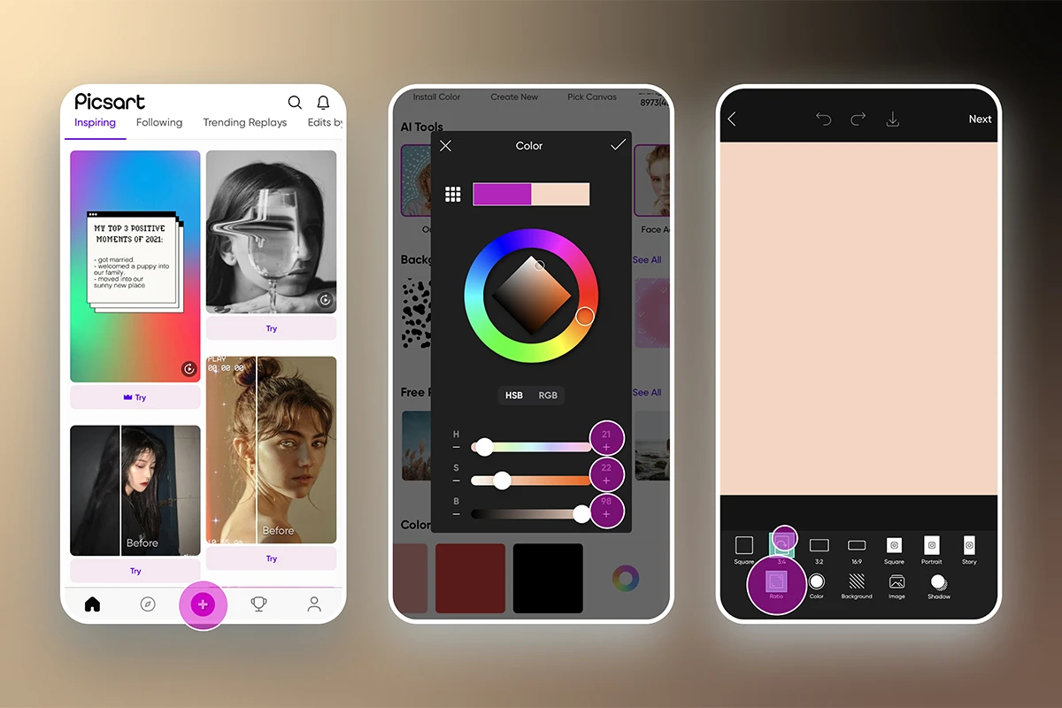
Do you prefer creating your designs on your smartphone? Follow these steps on how to create an effective infographic using the Picsart mobile app:
1) Open the Picsart app and tap the plus sign at the bottom of your screen to start a new design.
2) Scroll down to Backgrounds or Color Backgrounds. Select which type of background you want for your infographic, and make sure it’s something that won’t interfere with the other visual elements you’ll add to your design.
3) Select Tools from the bottom toolbar. Then, click Crop to choose a size for your infographic. Tap Apply in the top right corner of your screen.
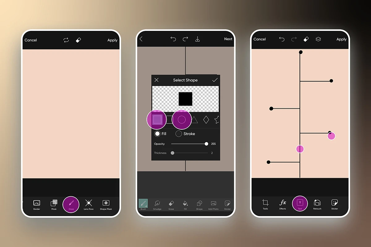
6) Select Text to add words to your infographic. After you write your text, tap the checkmark in the top right of the screen. Then, use the toolbar at the bottom of the screen to edit the font, color, and style of your text. When you’re done, tap Apply.
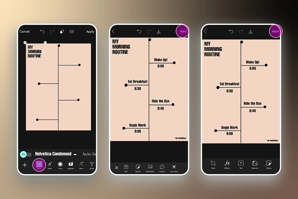
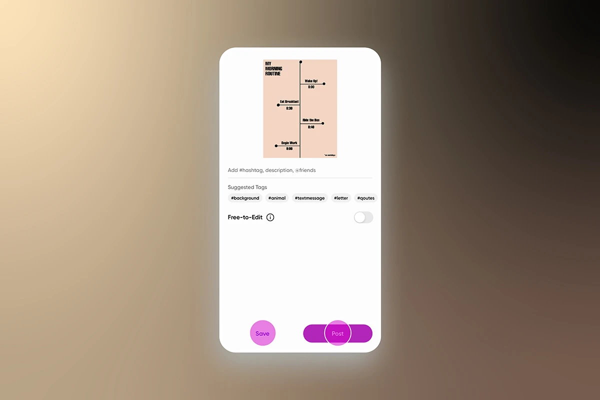
7) When your design is finished, click Next in the top right on the top right of your screen to save and share your infographic.
Create at the Speed of Culture
Picsart is a full ecosystem of free-to-use content, powerful tools, and creator inspiration. With a billion downloads and more than 150 million monthly active creators, Picsart is the world’s largest creative platform. Picsart has collaborated with major artists and brands like BLACKPINK, Taylor Swift, the Jonas Brothers, Lizzo, Ariana Grande, Jennifer Lopez, One Direction, Sanrio: Hello Kitty, Warner Bros. Entertainment, iHeartMedia, Condé Nast, and more. Download the app or start editing on web today to enhance your photos and videos with thousands of quick and easy editing tools, trendy filters, fun stickers, and brilliant backgrounds. Unleash your creativity and upgrade to Gold for premium perks!


