Contents
What Color Is Pastel Blue?
Pastel blue is a pale shade of blue and the pastel blue color code is #AEC6CF. Pastel blue provides just a wash of light color and is the perfect middle ground between subtle neutrals and vibrant pigments. Light blue, sky blue, and powder blue are other shades of blue that are very similar to pastel blue. Pastel blue is made by mixing a small amount of blue paint into white paint until you achieve a soft pastel hue.
- In the RGB color space, pastel blue is composed of 68.2% red, 77.6% green, and 81.2% blue.
- In a CMYK color space, pastel blue is composed of 15.9% cyan, 4.3% magenta, 0% yellow, and 18.8% black.
- Pastel blue has a hue angle of 196.4 degrees, a saturation of 25.6%, and a lightness of 74.7%.
- The pastel blue color has RGB values of R:174, G:198, B:207.
- The pastel blue color has CMYK values of C:0.16, M:0.04, Y:0, K:0.19. Its decimal value is 11454159.
Facts About Pastel Blue
- Pastel blue — described as a light, cloudy blue — was among the sixteen shades of blue used by French artist Cézanne.
- The great Russian artist Wassily Kandinsky described blue as peaceful, supernatural, deep, “typical heavenly color.” According to his theory, pastel blue is more serene and calming, as he claims that the lighter the color blue gets, the calmer it becomes. And when in the end it becomes white, it reaches absolute calmness.
- Pastel blue was also the sky against the peach skin of the cherubs in “The Birth of Venus” by Sandro Botticelli and pastel blue was the “blue dancers” of Edgar Degas.
- In general, the color blue conjures images of the sky, sea, and represents introspective journeys.
- Blue symbolizes wisdom, depth of understanding and is considered the color of bravery and dedication.
- The color blue is also associated with peaceful rest, profound insight, spiritual realization, open spaces, freedom, intuition, imagination, expansiveness, inspiration, sensitivity, trust, loyalty, sincerity, wisdom, confidence, stability, faith, heaven, and intelligence.
Is Pastel Blue the Same as Light Blue?
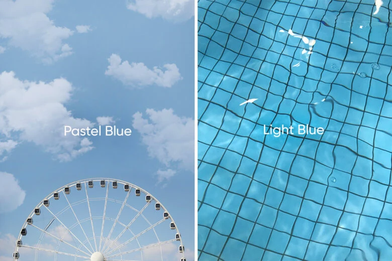
While pastel blue and light blue look really similar and are both considered pale shades of blue, they shouldn’t be mixed up. The color code for pastel blue is #AEC6CF, while the color code for light blue is #ADD8E6. If you compare the details of the two colors, you see that the main difference between them is saturation. The degree of saturation of light blue is 53.3% as opposed to the really low saturation of pastel blue: 25.6%.
How Do You Work with Pastel Blue?
To craft stunning pastel blue aesthetic designs, turn to Picsart, an awesome all-in-one photo and video editing app and desktop editor. There are so many ways to incorporate this delicate and dreamy pastel color in your design. Select pastel blue as your background by typing pastel blue color code (#AEC6CF); choose a pastel blue sticker from the fantastic collection; add a pastel blue text, a pastel blue shadow to your black font; or add pastel blue geometric designs.
You can also search for pastel blue hashtags on Picsart and check out some pastel blue edits by Picsart Creators for inspiration. Here’s a collage by Cleo; pastel blue as a movie or anime theme; and a photo edit in pastel blue.
Want to dive deeper? Learn all about pastel colors and how they’re made. Check out our article on pastel red and Tiffany Blue for more palette ideas.
What Colors Go with Pastel Blue?
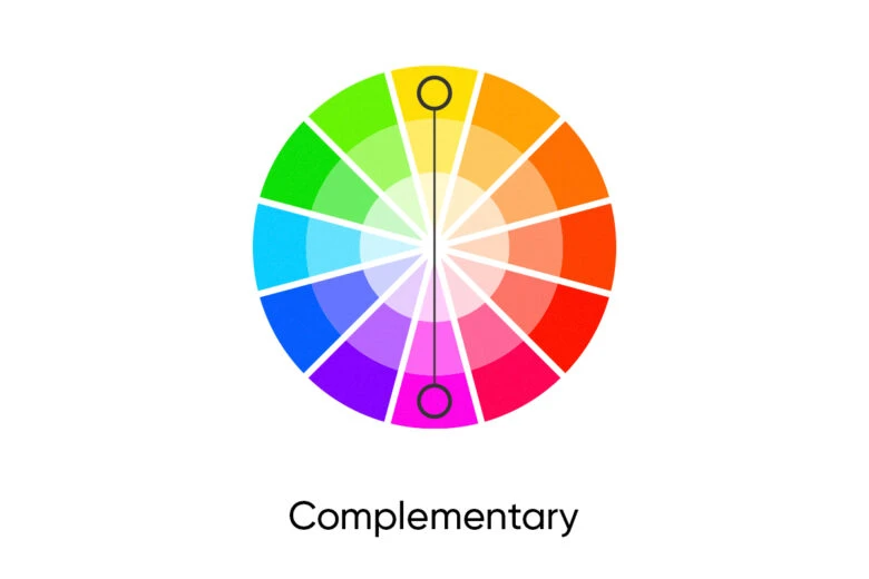
Complementary colors: The Complementary color scheme is made up of two colors opposite one another in the color spectrum. For example, the pastel blue color is called the base, and Sashay Sand (#CEB4AD) is its complementary color, called the complement.
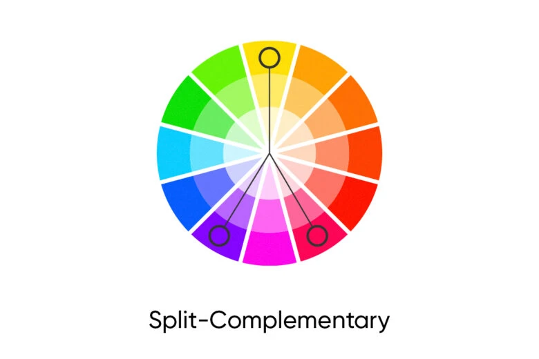
Split Complementary Colors: The Split Complementary color scheme is made up of three colors. For example, the base, pastel blue, can be paired with the two colors on either side of the complement color (#ceb4ad) which are: Insightful Rose (#CEADB6) and Bungalow Beige (#CEC5AD).
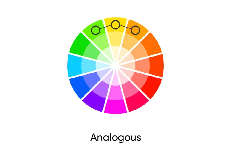
Analogous colors: The Analogous color scheme is made up of three colors that are next to one another on the color wheel. The palette is made in a similar fashion to how the Split Complimentary palette is made. However, in this pastel blue example, the two secondary colors are adjacent to pastel blue, the base, not the complement. They are The Sherwin Williams Awesome Violet (#ADB6CE) and Watery #ADCEC5.
Triadic colors: The Triadic color scheme is made up of three colors spaced evenly (120°) apart on the color wheel. The two colors paired with pastel blue are Lilac (#CEADC7) and Baize Green (#C7CEAD).
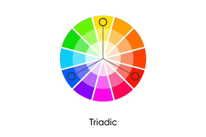
Tetradic colors: The Tetradic color scheme is made up of four colors spaced evenly (90°) apart on the color wheel. In this scheme, the colors paired with the pastel blue are: Lilac (#CEADC7), Sashay Sand (#CEB4AD), and Kiwi (#ADCEB4).
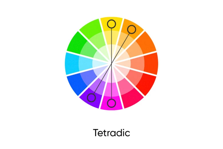
Monochromatic colors: To create a Monochromatic color palette with pastel blue, pair pastel blue with: medium-light shades of cyan (#89a1a9), (#95adb6), Sterling Blue (#A2B9C2), and very light shades of cyan (#D4EDF6).
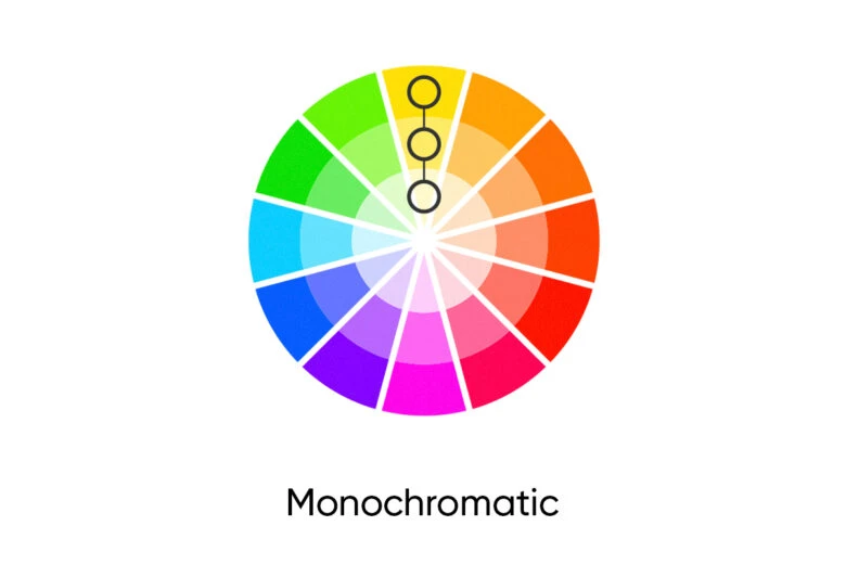
Similar colors: Check out colors closely related to pastel blue: Beau blue with hexadecimal color code #BCD4E6, Light blue (#ADD8E6), Columbia blue (#C4D8E2), Light steel blue (#B0C4DE), and Pale Cerulean (#9BC4E2).
What Are Some Pastel Blue Color Palette Ideas?
You can create unique palettes to express your design aesthetic and captivate your followers. Check out some gorgeous palette ideas with arresting pastels to bring your design to the next level.
Sunrise in Provence: Draw some inspiration from the poetic palette of the sunrise in the lavender fields of Provence. Combine pastel blue with dark pastel blue (#799FCB), light red (#FEC9C9), pastel red (#F9665E), pastel green (#78DD78), menthol (#B5F9A8), and lavender (#E6E6FA).
Romantic Palette: To create a romantic and elegant palette combine pastel blue with Vanilla Ice (#F48BA9), Metallic Pink (#F0B0BC), Pale Pink (#FADADE), and Sky Blue (#86CBED).
Beach-Inspired: Bring together beach-inspired hues for this playful palette; combine pastel blue with light green (#8BF59C), Magic Mint (#B3FABB), Tea Green (#CDFFCE), Light Goldenrod Yellow (#F8FFD1), Water (#C5ECF6), and Blizzard Blue (#ADDDF3).
What Are the Different Shades of Pastel Blue?
A shade is achieved by adding black to any pure hue, while a tint is created by adding white. Here are some shades of pastel blue.
Cloudburst (#5B8899)
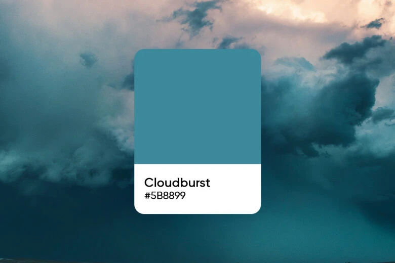
Toyo Ink (#545E62)
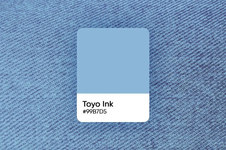
Faded Flaxflower (#9CB2BA)
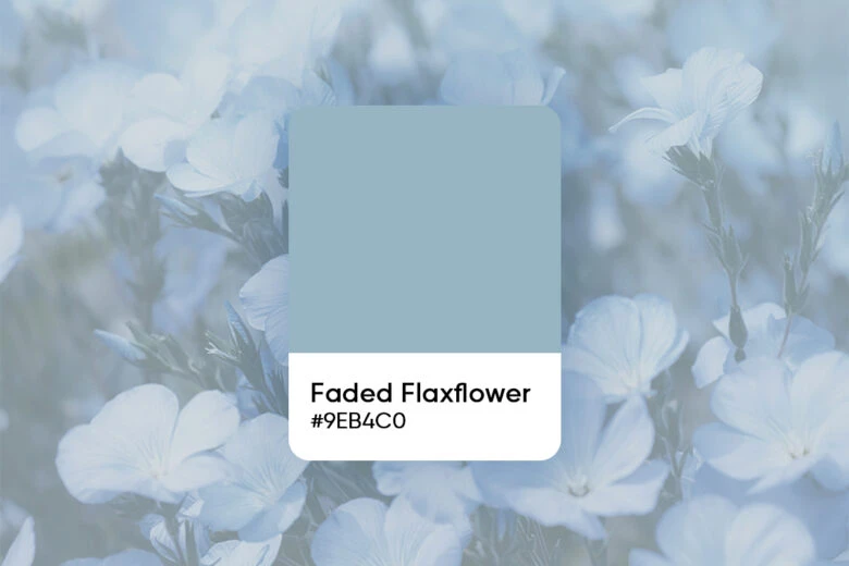
Delft (#8B9EA5)
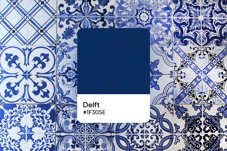
To create tints of pastel blue, start adding white to the pure hue. Here are some of them:
Wondrous Blue (#BBCFD7), Iceberg (#D6E2E7) Bluebird Feather (#709BAB), and French Moire (#A2BDC8).
Create a Pastel Blue Aesthetic with Picsart
Now let’s dive right in and start creating your ultimate pastel blue aesthetic with Picsart.
Step 1) Open the Picsart app and tap on the plus sign (+) at the bottom of the screen to start your project.
Step 2) Scroll down to Color Backgrounds, then select Color Picker. Choose pastel blue using the color wheel or type in the pastel blue color code (#AEC6CF) and your dreamy background is ready.
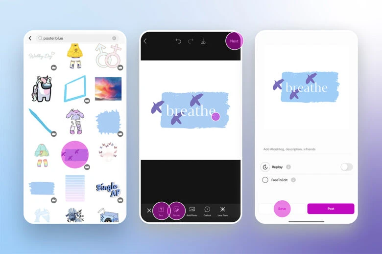
Step 3) Scroll across the Editor toolbar on the bottom of your screen and tap on Sticker then pastel blue to select a sticker from our rich collection of stickers.
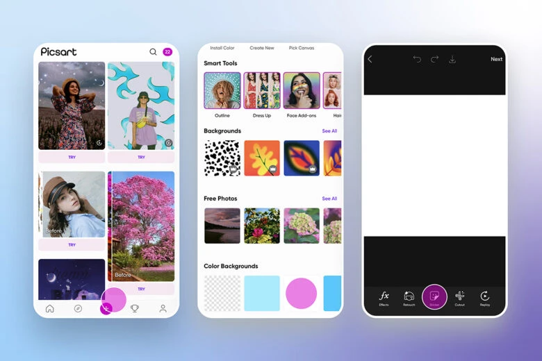
Step 4) To design your own pastel blue color palette, scroll across the toolbar at the bottom and tap on the Draw icon, then tap on the rainbow Color Chooser in the bottom left corner of the toolbar and use the Color Wheel to design. Experiment with shades of pastel blue, combine it with Tiffany blue or with other Pastel colors. To create a pastel blue color palette from your photo, check out our article: Color palette from image
Step 5) To add a pastel blue text to your design, scroll across the Editor toolbar and tap on Text. Write your text, then tap on the upper right checkmark, scroll right to pick a font, and then tap on Color to choose pastel blue as the color of your text. Click Apply when you’re done.
Step 6) Do you need just a splash of pastel blue in your photo? Tap on Effects and then Colors. Click Color Splash and move the wheel to the pastel blue-colored part of the photo. You can then move the two sliders to adjust the hues.
Step 7) To add pastel effects to your design, select Magic Effects at the bottom of the screen, then select the Pastel Effect.
Step 8) Save and share your design.
Do you want to use the desktop version? Simply open the Picsart Editor and pick a ratio to open a blank editing canvas. Remember, you can always change the photo size later. You can also click the Upload button and upload the image you’d like to edit. There are so many ways to get a cool pastel blue design. Play around with Text, Effects (i.e. Pastel effects), Templates, and Stickers to craft your perfect image. Open the editing toolbar on the left to proceed with the same steps as with the Picsart app.
Create at the Speed of Culture
Picsart is a full ecosystem of free-to-use content, powerful tools, and creator inspiration. With a billion downloads and more than 150 million monthly active creators, Picsart is the world’s largest creative platform. Picsart has collaborated with major artists and brands like BLACKPINK, the Jonas Brothers, Lizzo, Sanrio: Hello Kitty, I am a Voter, Bebe Rexha, Maroon 5, One Direction, Warner Bros. Entertainment, iHeartMedia, Condé Nast, and more. Download the app or start editing on web today to enhance your photos and videos with thousands of quick and easy editing tools, trendy filters, fun stickers, and brilliant backgrounds. Unleash your creativity and upgrade to Gold for premium perks!


