2020 may have thrown a wrench in our plans, both personal and professional, but 2021 is all about moving forward. However, everyone’s still unpacking the events of the past 12 months, and you’ll see that thought process play out in this year’s design and color trends. People will gravitate towards harmonious color combinations over bright, jarring contrasts. You’ll see a movement of artists and brands looking to break away from the things that no longer serve them and focus on the things that give them joy and purpose. In design, this will translate into simplified designs and soft, earthy color palettes. So, what’s the color for 2021? Let’s take a look.
What Is Pantone’s Color of the Year for 2021?
Each year, the Pantone Color Institute looks toward the future of design, drawing inspiration from fashion and interior design trends, new artists, technology, and current events. Their prediction? This year is all about optimism and resilience. Pantone’s pick for the color for 2021 is actually a combination of two colors — Illuminating (#F9E547), a bright, cheery yellow, and Ultimate Gray (#97999B), a rock-solid gray tone. The marriage of these two colors represents a proposed theme for 2021: hopefulness supported by fortitude; practicality mixed with warm optimism.
Unlike 2020’s color of the year — Classic Blue — which brought to mind feelings of serenity and simplicity, the combination of Illuminating and Classic Gray is about taking action and thoughtfully moving forward. As we get further into 2021, many people will find themselves drawn to colors that represent warmth and dependability. When used in graphic design, Illuminating and Ultimate Gray work together to uplift and encourage us to make our mark on the world. It’s time to embrace the professional and personal growth that this year will bring.
View this post on Instagram
After the chaos that was 2020, it’s time to reflect and go back to our roots. From a design perspective, this means embracing grounding colors that can inspire the strength to deal with whatever curveball life throws at you. Last year, you were likely forced to take stock and figure out what’s truly important to you. This year, it’s all about nurturing those things and giving them the space to grow.
Trending colors for 2021, like the Pantone colors of the year, will offer comfort, support, encouragement, and hope. The pandemic brought on a renewed emphasis on “home,” and on the struggle to draw the line between work and personal lives. Back-to-back Zoom calls turned our bedrooms into offices and classrooms, and screens took the place of in-person gatherings. It’s 2021 and we’re starting to get accustomed to the new normal. Expect to see designs made with colors that call to mind cozy feelings of the home that we want, even if it may not match up to our sometimes-crowded, often-messy reality. Let’s take a look at the trending colors you can expect to see a lot of this year.
1. Canyon Dusk (#C19A86)
Behr’s 2021 color of the year, Canyon Dusk, is a warm, earthy tone that suggests harmony with nature. It’s another grounding color that can bring feelings of comfort, assurance, and a little bit of escapism to a design. Last year, there was a lot of talk about the collective human experience and the little things that bring us all together. A color like Canyon Dusk encourages us to embrace the moments that make us human, from exploring the great outdoors to baking sourdough bread at home.
2. Aegean Teal (#708A8C)
Few things can relieve stress like watching the flow of water. Whether it’s ocean waves or a garden fountain, water has the power to give the sense of calm that so many people are currently searching for. A dusty blue-green teal, like Benjamin Moore’s color for 2021, marries the soothing nature of blue with uplifting tones of green. It encourages reflection and ties us to something bigger than ourselves. It can pair well with a pastel red shade to create the feeling of a coral reef budding with life, or it can be used to ground lighter palettes that include pale lavender and sage green.
3. Gold (#DAA520)
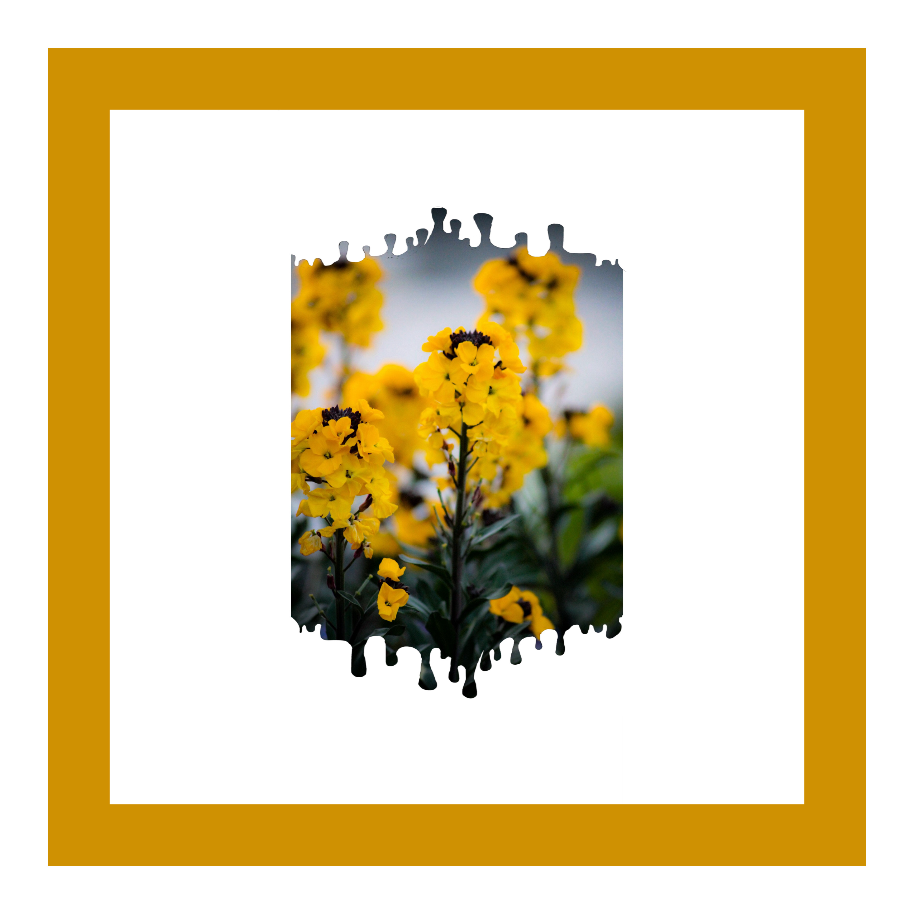
One of Shutterstock’s top color predictions for 2021 is a dark, rich golden yellow that’s been growing in popularity. This warm, deep gold evokes images of fiery golden hour sunlight or autumn leaves blowing in the wind. Gold is often associated with prestige and trustworthiness. It can be used to frame an image, add a regal flair, or make a logo design look more “official.” You can pair gold with jewel tones for a more luxurious, dreamy look, or use it with slate gray to make things feel more natural.
4. Epoch (#57333F)
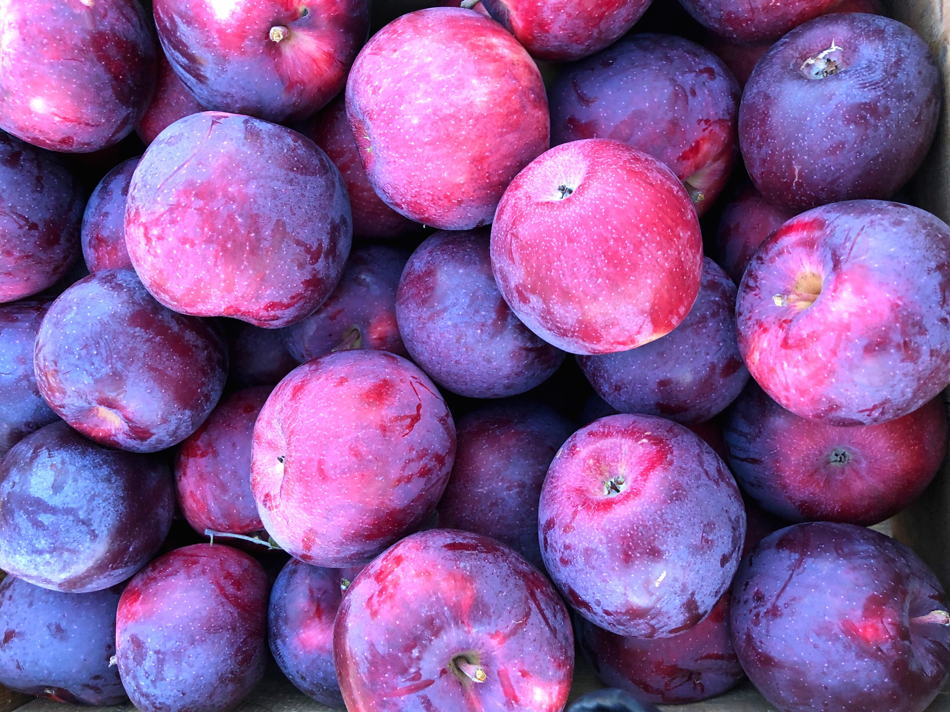
While muted natural tones may dominate the color palette for 2021, there’s still room to make a statement. The paint company Graham & Brown chose a deep, rich plum shade for their color of the year. A proud, luxurious color that just screams royalty, Epoch can be used to introduce some drama to your designs. Color theory indicates that, when paired with soft lavenders, it can lend a sophisticated look to your designs. On the other hand, peach and pink tones can give this decadent color a playful vibe. Using it alongside a strong teal will create a twist on peacock-inspired color palette that will have no trouble catching eyes!
5. Burnt Coral (#E57868)
Coral has been popular in the design world for years, and it was even Pantone’s color of the year for 2019. In 2021, the bright coral you know and love is getting a bit of an edgy makeover. Instead of cheery peachy and pink hues, we’ll see more of a darker coral that suggests depth and maturity. Still a trendy color, burnt coral is great for pop-up campaigns and for adding a kiss of warmth to your designs.
6. Champagne (#FAEBD7)
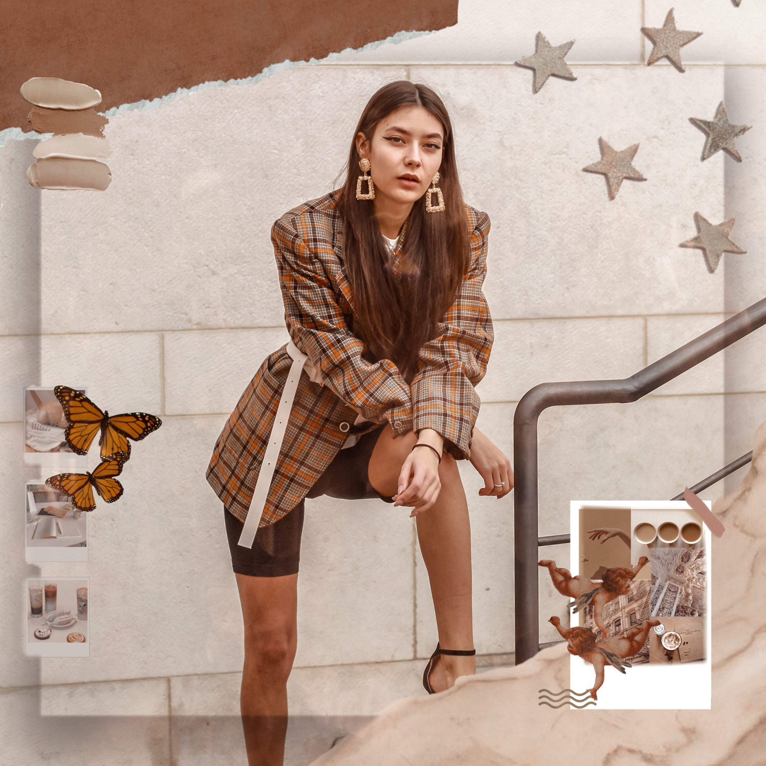
After being stuck at home for more than a year, many people are craving adventure and new experiences. Shutterstock calls this champagne color “Set Sail Champagne,” and they’ve named it one of their top color predictions for 2021. It’s the color of sails unfurling in the ocean breeze; an organic, earthy tone that creates a blank canvas for you to write your color trends story. It’s technically a pastel orange, meaning that it can fit right in with any pastel palette. Or, you can lean into the ocean aesthetic by adding a darker teal, aqua, or baby blue. You can also pair it with browns, taupes, and greens for a more natural look.
 via PicsArt
7. Pale Sage (#C1CBC0)
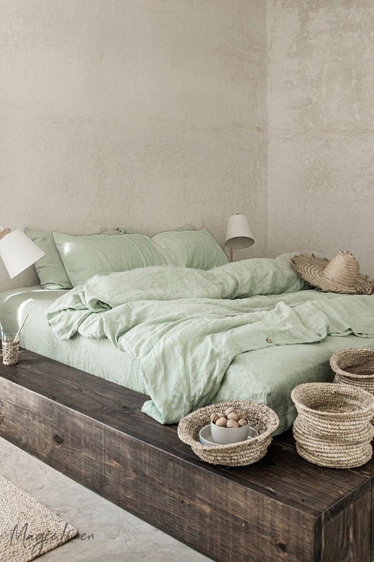
Another earthy tone, pale sage is at the top of many 2021 trending colors picks, including those of paint brands Coloro and Valspar. This muted green offers a connection with nature while bringing an optimistic, futuristic quality to your images. A modern take on a classic shade, pale sage highlights our collective longing for restoration, both in the earth around us and in our own physical and mental health.
8. Dusty Lavender (#B19BAA)
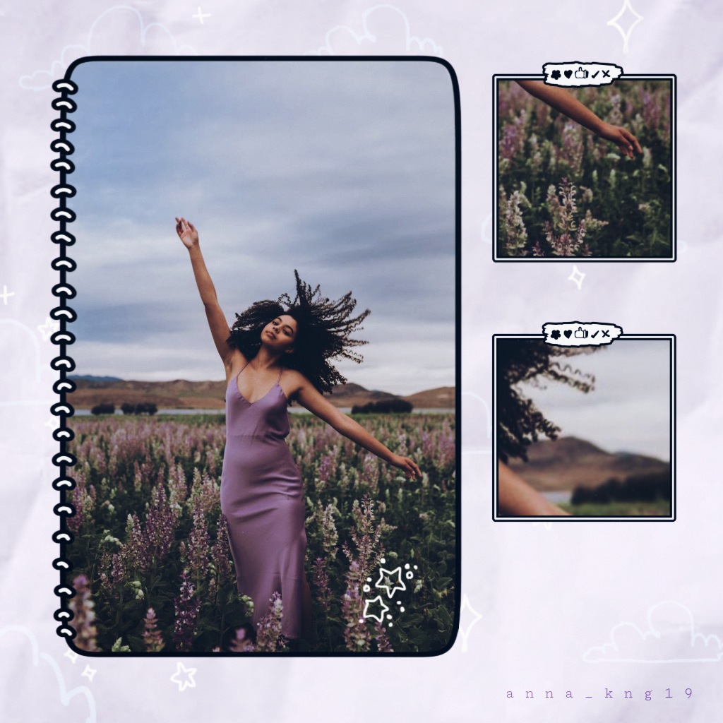
Dusty lavender is a pastel shade that packs a color trends punch. This dynamic shade manages to stay warm and inviting, despite its sophistication. It evokes images of flower-filled gardens in the early morning light and organic, plant-based dyes favored by sustainable clothing brands. This color shines in designs inspired by history but focused on creating a brighter, more positive tomorrow.
What Are the Biggest Color Trends for 2021?
Like the above-mentioned trending colors of 2021, this year’s color trends will focus on creating designs that inspire soft optimism and comforting dependability. You got super creative with color trends in 2020. Now, it’s time to use that creativity to shape the world you live in. You can use colors strategically to evoke a wide range of emotions, depending on the purpose of your design. Whether you want people to come away feeling hopeful, inspired, thoughtful, or entertained, these 2021 color trends can help you create an image that people won’t easily forget.
1. Muted Earth Tones and Comforting Neutrals
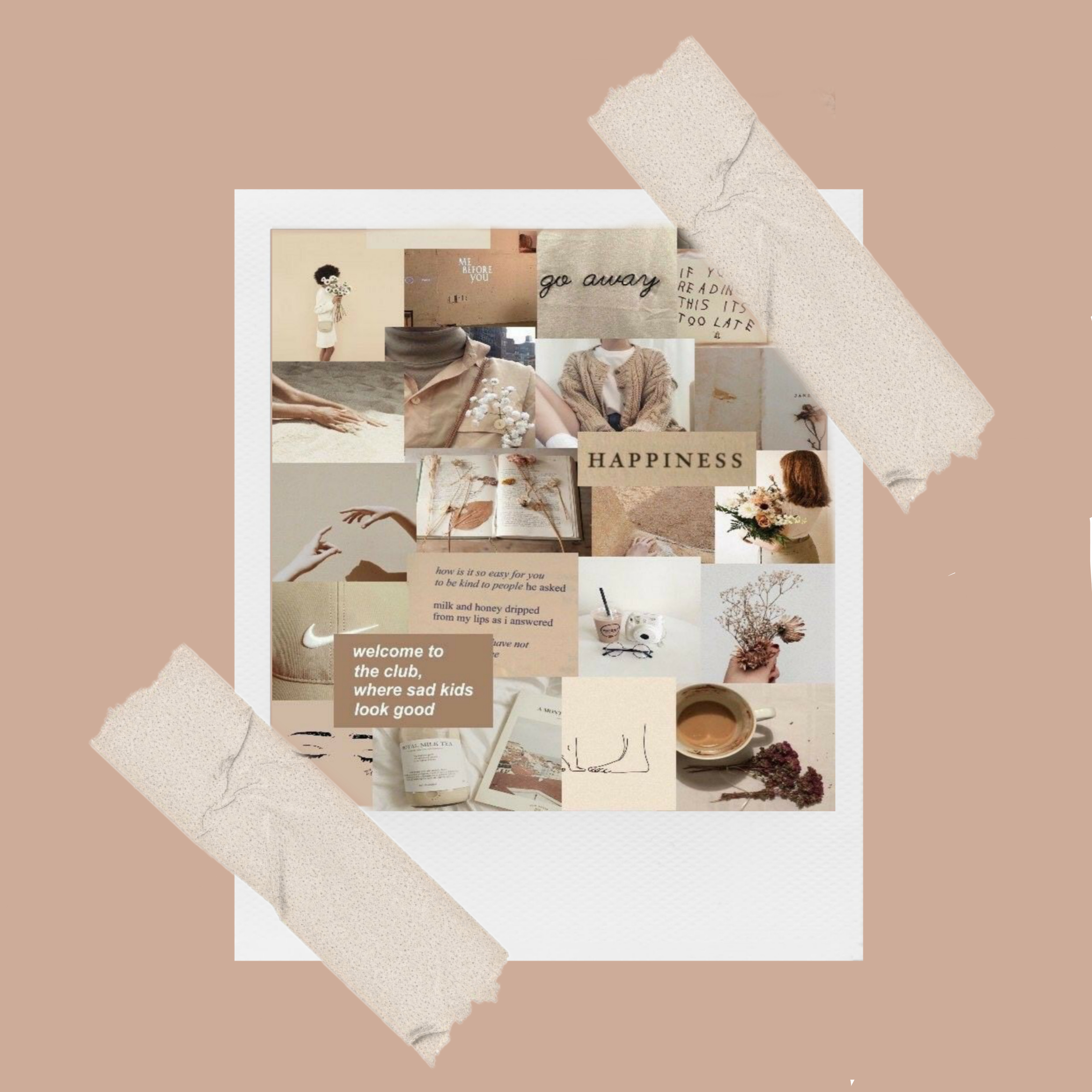
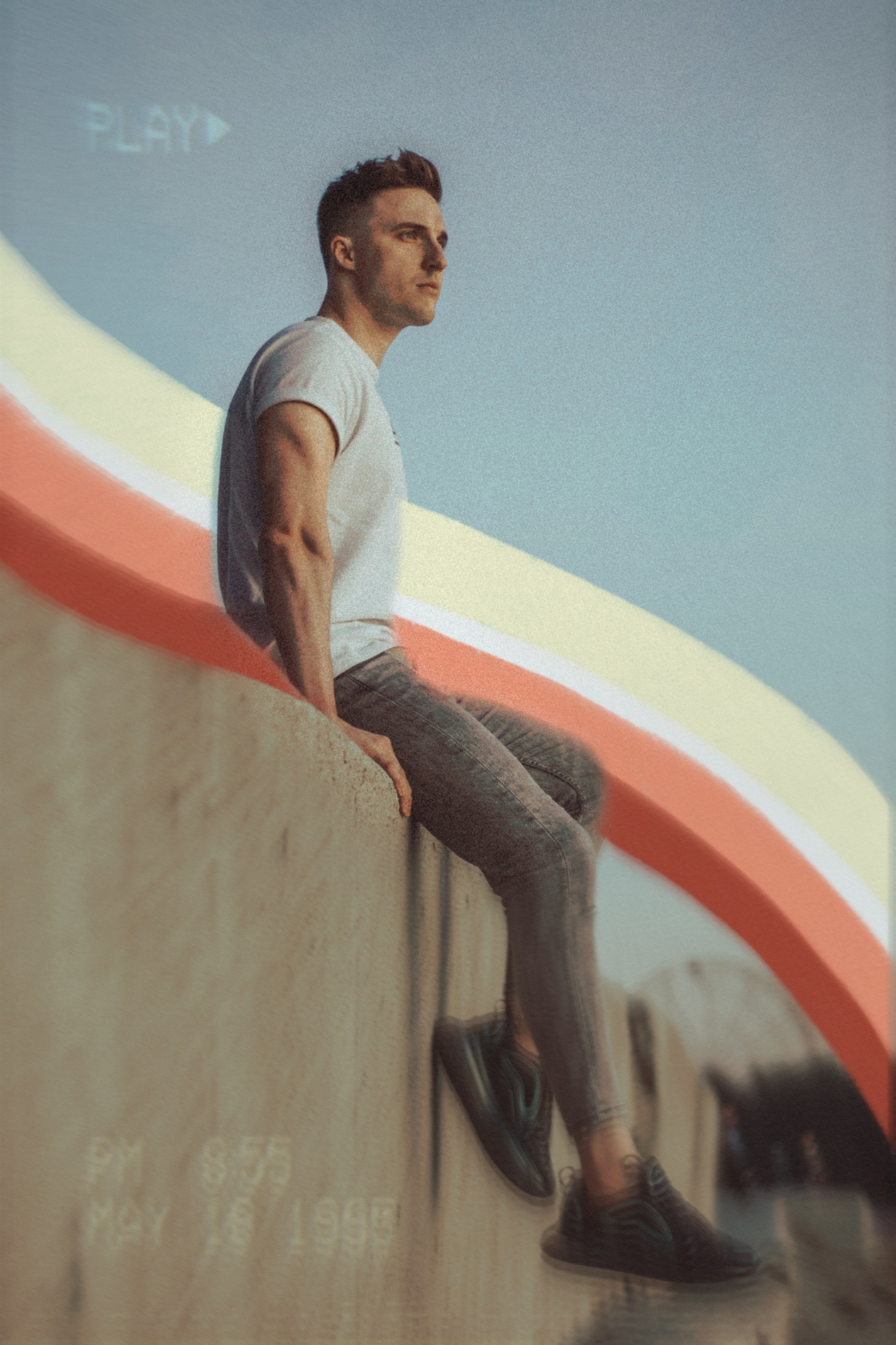
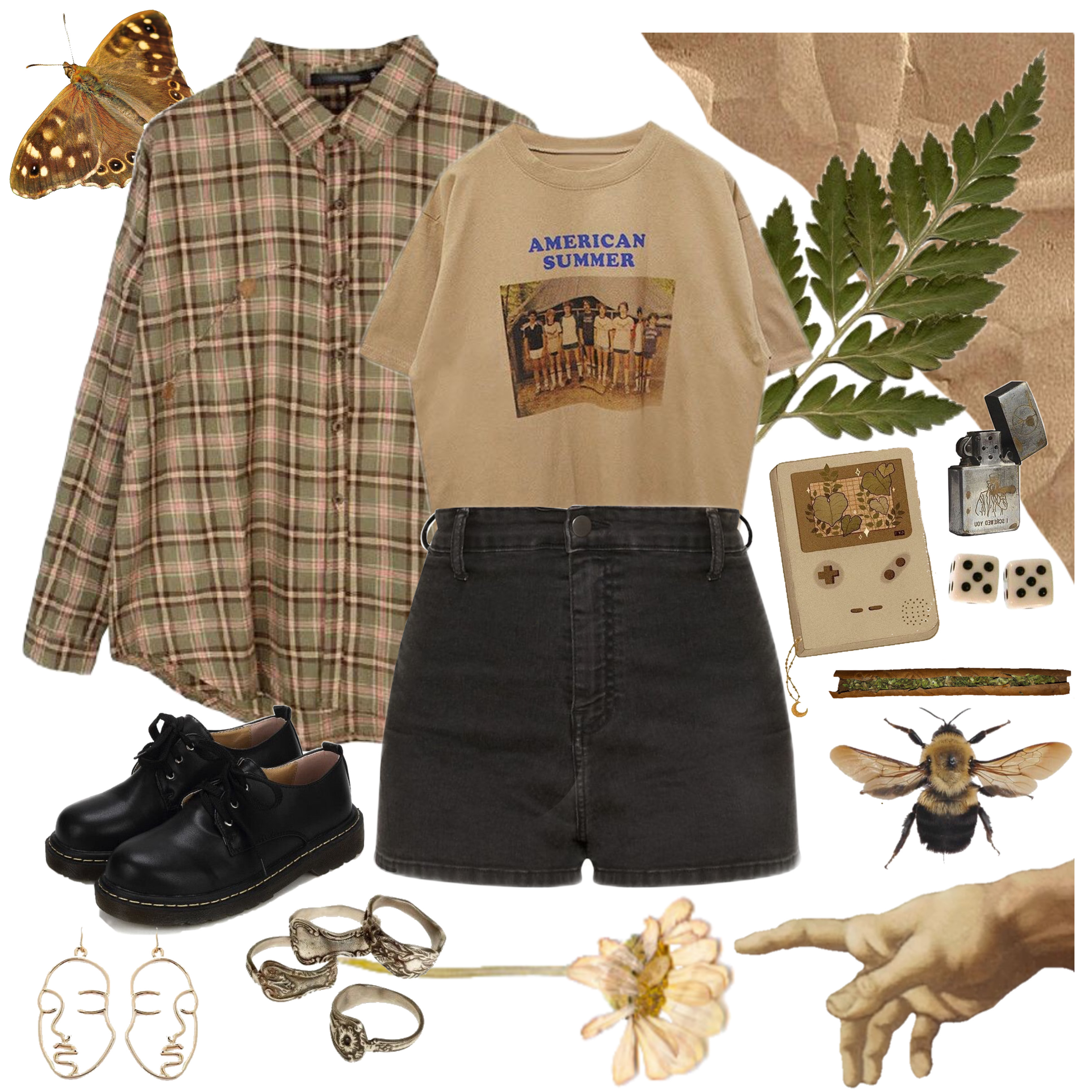
2020 was the year of virtual interaction, of scrolling more than we ever thought possible, and of living our lives in front of a screen. For many, it taught lessons about practicing mindfulness when it comes to screen time. It’s no surprise that in 2021 people are drawn to natural, earthy tones that can offer comfort for tired eyes that stare at blue light for most of the day. Simple, subtle designs in natural colors, such as Canyon Dusk and Pale Sage, can make a design stand out with its softness. To add a touch of nostalgia to this comforting color palette, try using PicsArt’s photo editing software to add vintage photo effects to your designs.
2. Soft Nature-Inspired Hues
If you want to take your earth tones to the next level, you can experiment with adding in light blues, purples, and greens. This cool nature-inspired color palette evokes the freshness of spring greenery with an added layer of calm sophistication. Pastel colors aren’t just for nurseries and Easter decorations! They can add a smooth, mellow feel to earthy designs and help you get that peaceful, zen vibe that you’re looking for.
3. Statement Blues
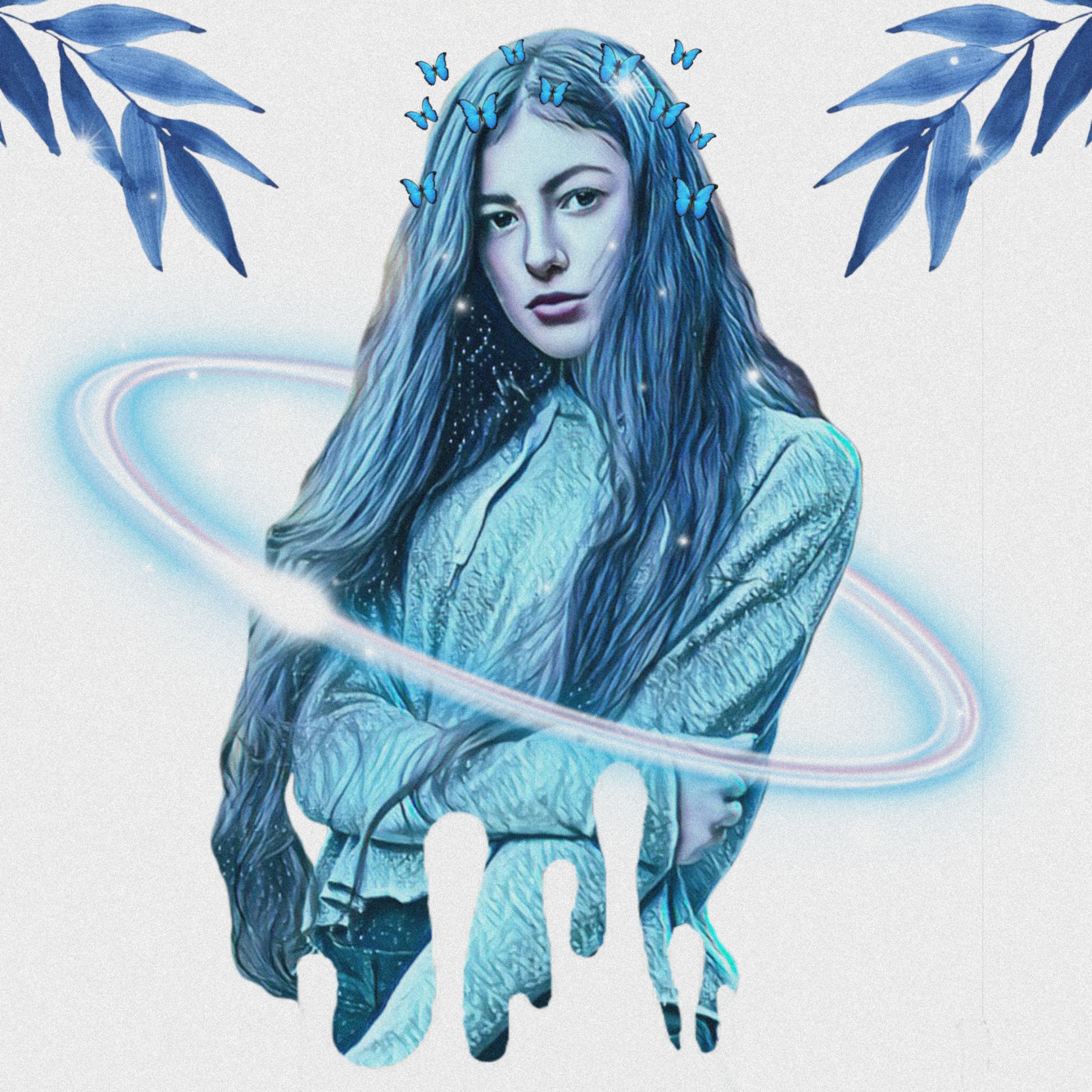
Of course, 2021 isn’t all about harmony and comfort. It’s also the time to create designs that help you stand out and make a statement. Color experts predict that blue is going to be the megaphone that gets your voice heard. Whether it’s a light, airy cerulean, a strong, punchy teal, or a bold, fashion-forward cobalt, blue is a great color to help your message shine. If you’re going to go with a statement blue, make sure there’s nothing unnecessary in the image to distract from its impact. You can use PicsArt to remove clutter from your photos and make sure your design takes center stage!
4. Romantic Bouquets
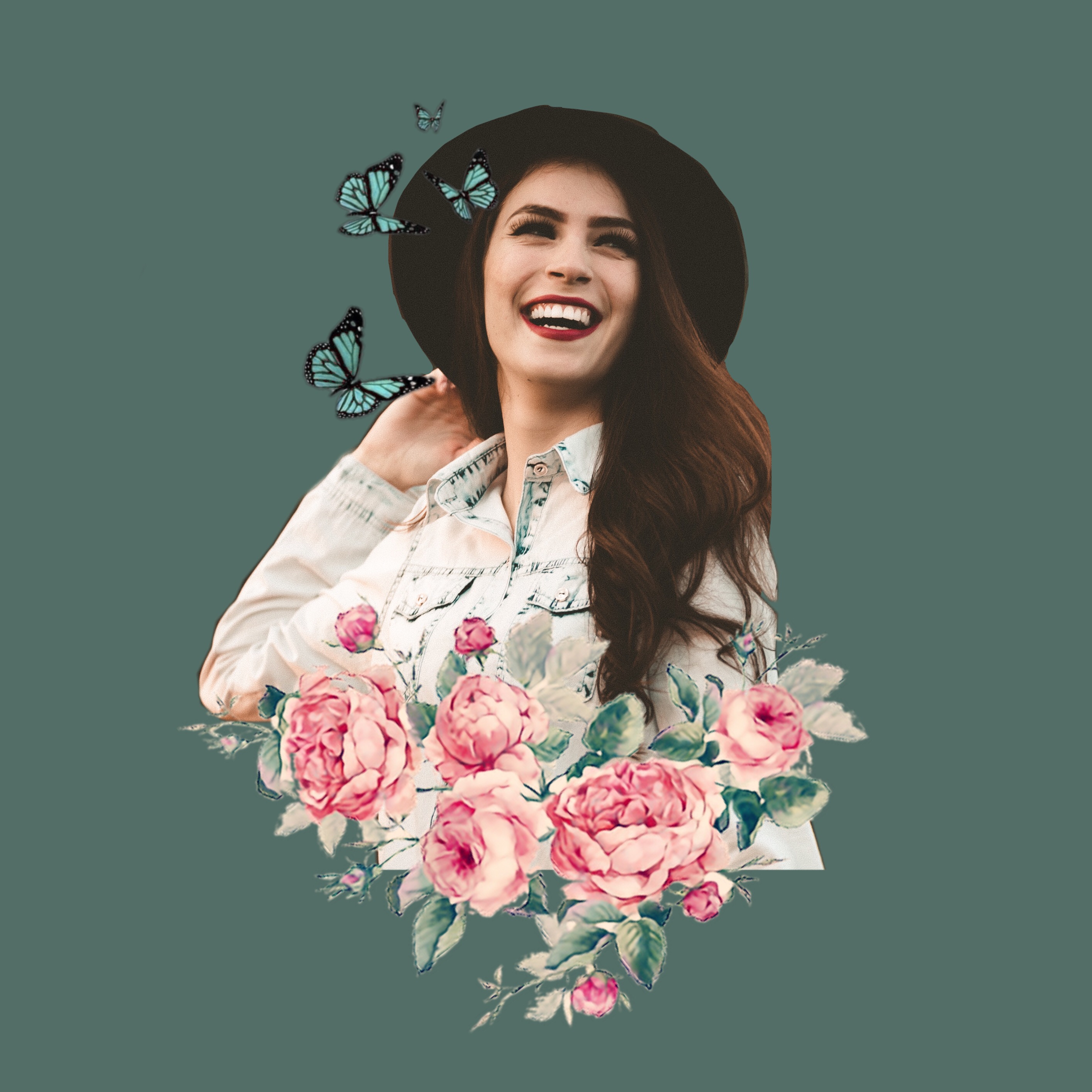
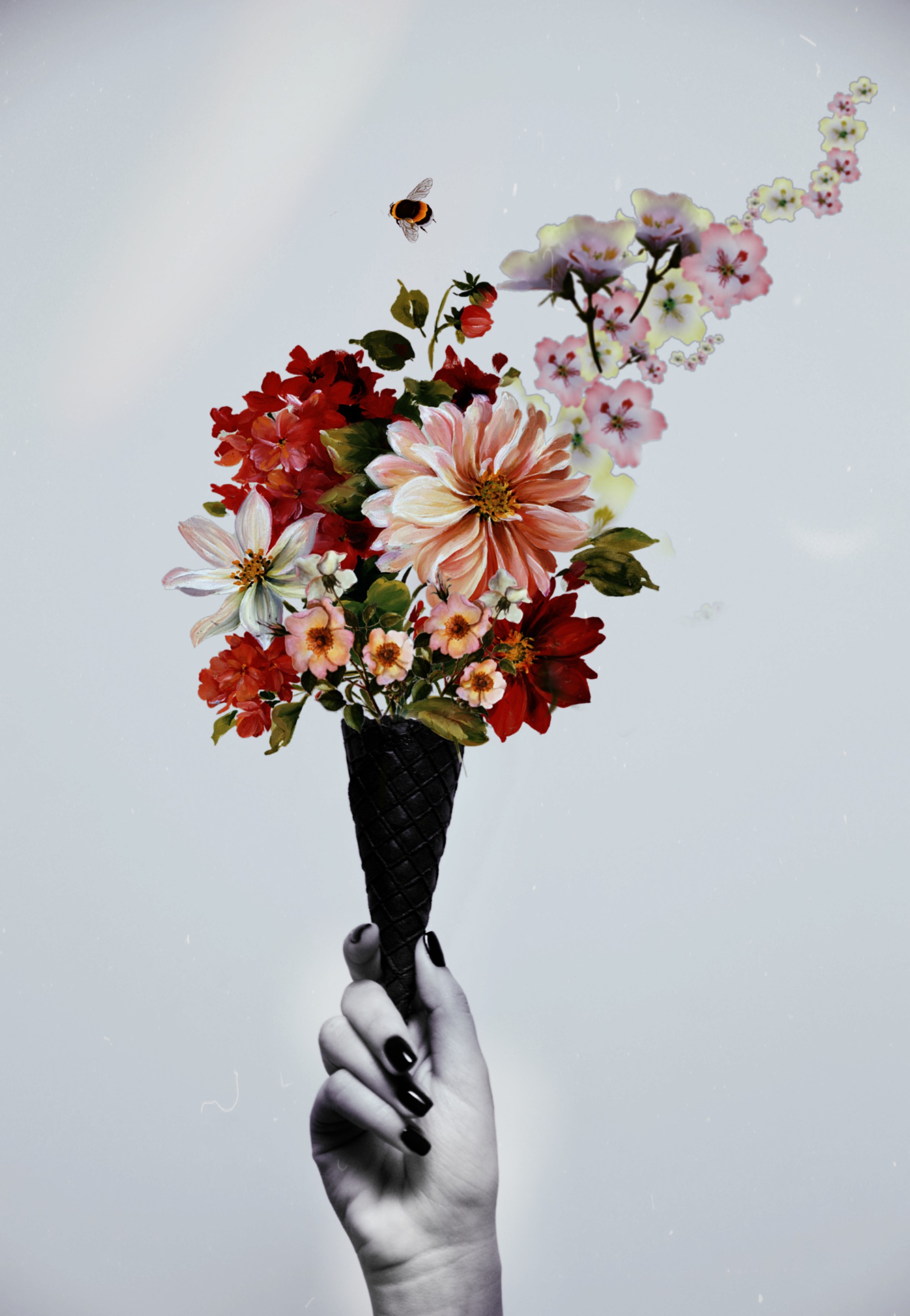
It’s time to put on your rose-colored glasses! One of the color trends that are sure to dominate 2021 are palettes inspired by romantic bouquets. A rejuvenating mix of rosy and dusty pinks creates an analogous color combination that feels both natural and bohemian. Pairing these red-base colors with cream and pale green can create a dreamy contrast in your designs. These bright, warm colors give the dose of positivity and romance that we could all use right about now.
The easiest way to use this color trend? Search the #FreeToEdit image library for a photo of a floral bouquet that speaks to you. Then, use PicsArt to create a color palette from the image. No hassle or advanced color theory required!
5. Vivid, Contrasting Brights
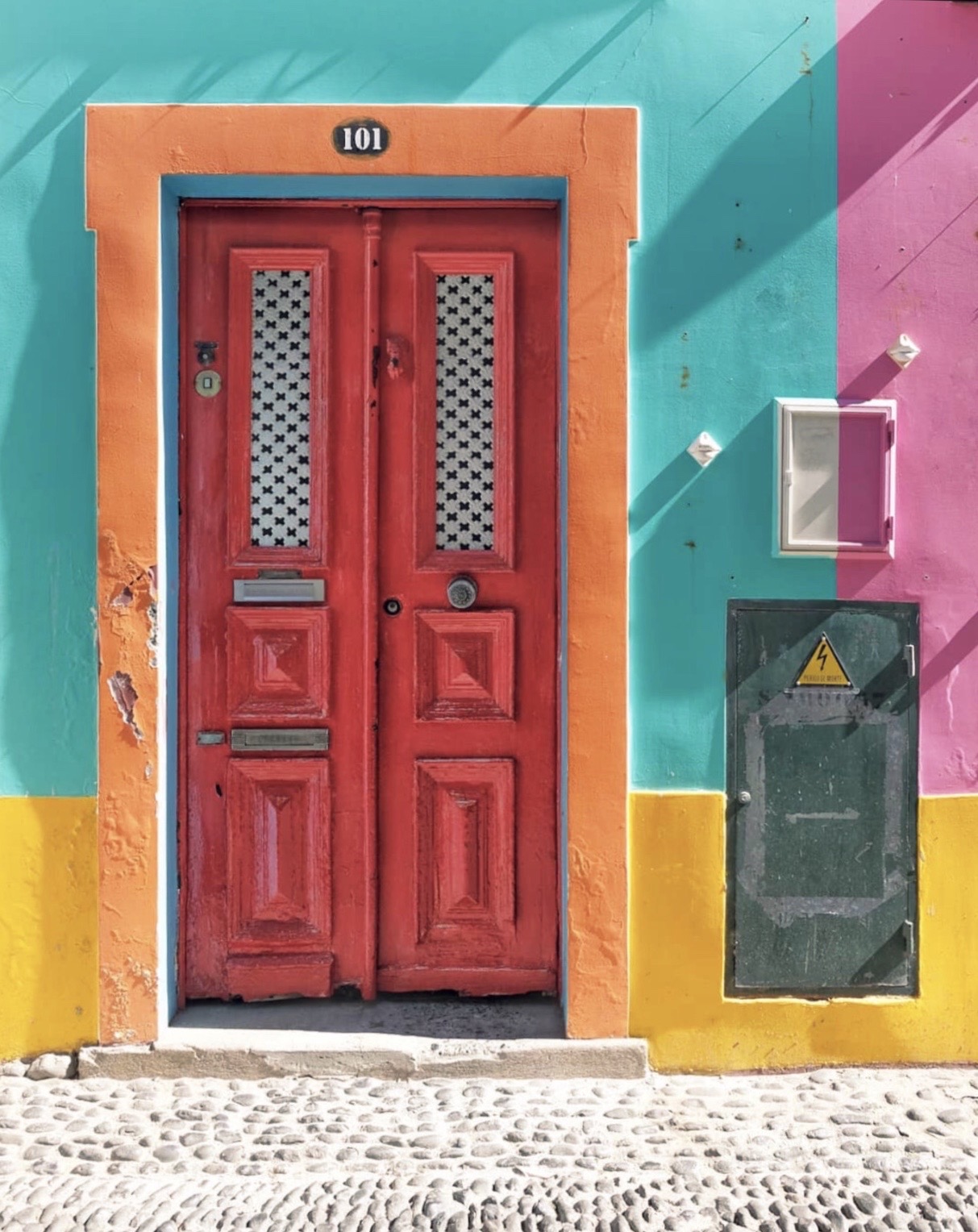
Though muted, earthy tones are the primary color influence for 2021, there’s still room to make some noise with vivid, contrasting brights. As independent colors, vivid tones can add a dash of spice to a design, but pairing them together can make the entire image bold and flashy. Pantone suggests using Illuminating and Ultimate Gray with bright blues and pinks to create an exciting color scheme that’s inspired by tropical birds. Alternately, pairing a bright, warm purple with a deep, vibrant gold can create a rich, luxurious aesthetic. This 2021 color trend is all about finding a color scheme that makes you happy and letting it sing in your design.
The trending colors for 2021 are largely born out of the events and experiences of 2020. Last year was a time of reflection and uncertainty about the future, but one thing came to the forefront — our shared experience as humans. Whether you’re launching a new brand or trying to find a way to modernize your current aesthetic, these new color trends can help add empathy and optimism to your designs.
Make Awesome
PicsArt all-in-one Photo and Video Editor, Collage, and Sticker Maker is the world’s largest creative platform with over 150 million monthly active creators and influencers. PicsArt has collaborated with major artists and brands like Taylor Swift, The Jonas Brothers, Gwen Stefani, Maroon 5, Lizzo, Meghan Trainor, One Direction, MONSTA X, Warner Bros. Entertainment, iHeartMedia, Condé Nast, and more. Download the app today to level-up your photos and videos with thousands of quick & easy editing tools, trendy filters, fun stickers, and brilliant backgrounds. Unleash your creativity with PicsArt and upgrade to Gold for awesome premium perks!

 via PicsArt
 via PicsArt
 via PicsArt
 via PicsArt
 via PicsArt
 via PicsArt
 via PicsArt
 via PicsArt
 via PicsArt
 via PicsArt
 via PicsArt
 via PicsArt


